This was a group project made up of myself and three other peers on my course, we were tasked with rebranding a charity we had selected from five current charities local to Reading that needed help with their visual identities. I really enjoyed working on this rebranding project, not only because I think we produced a very successful outcome, but because I got the opportunity to work with a mix of people I never would have worked with otherwise. We also helped each other build important skills during the process, such as research interviews, presenting techniques, and complex problem solving that before this years difficult circumstances we would not have to face.
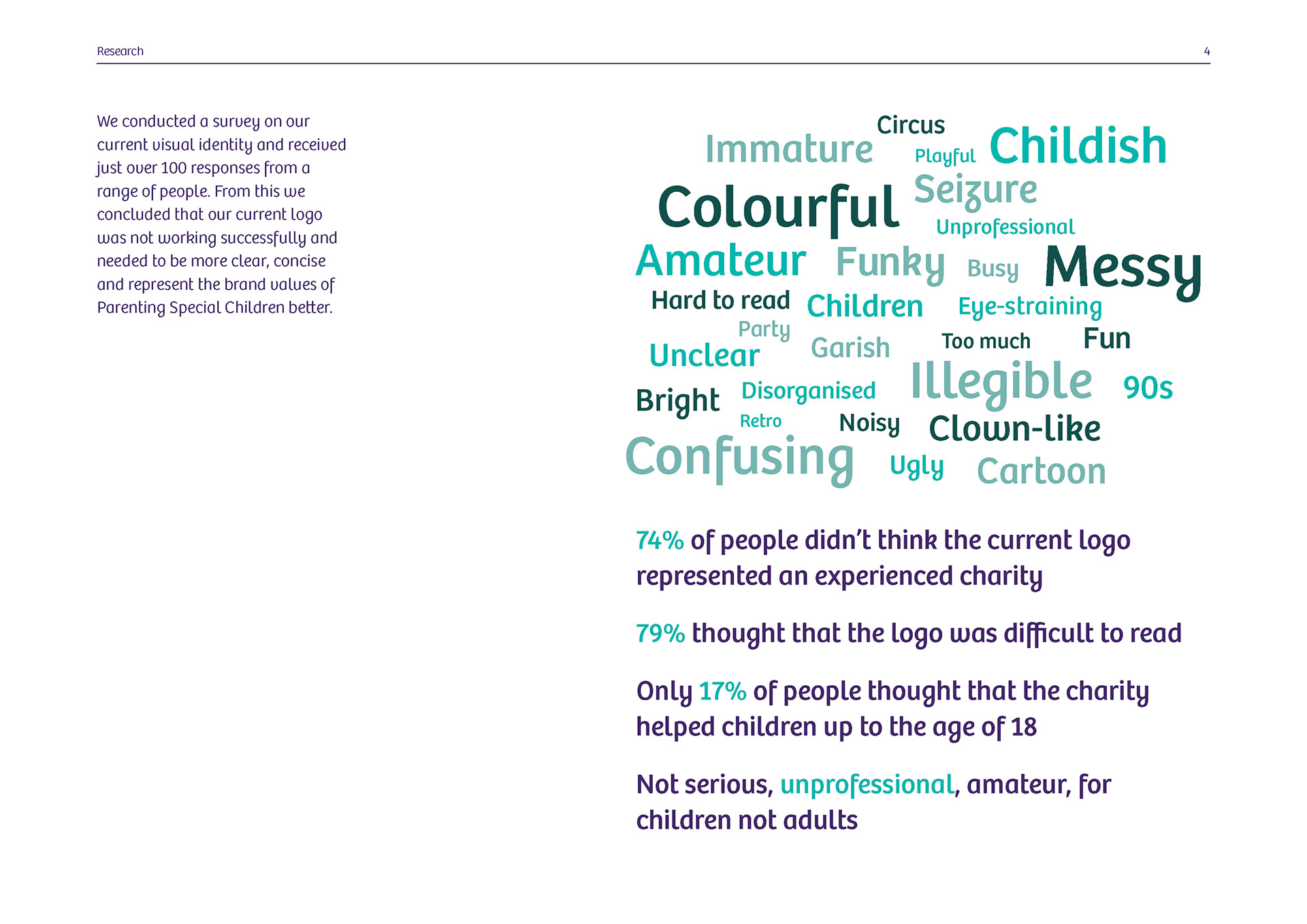
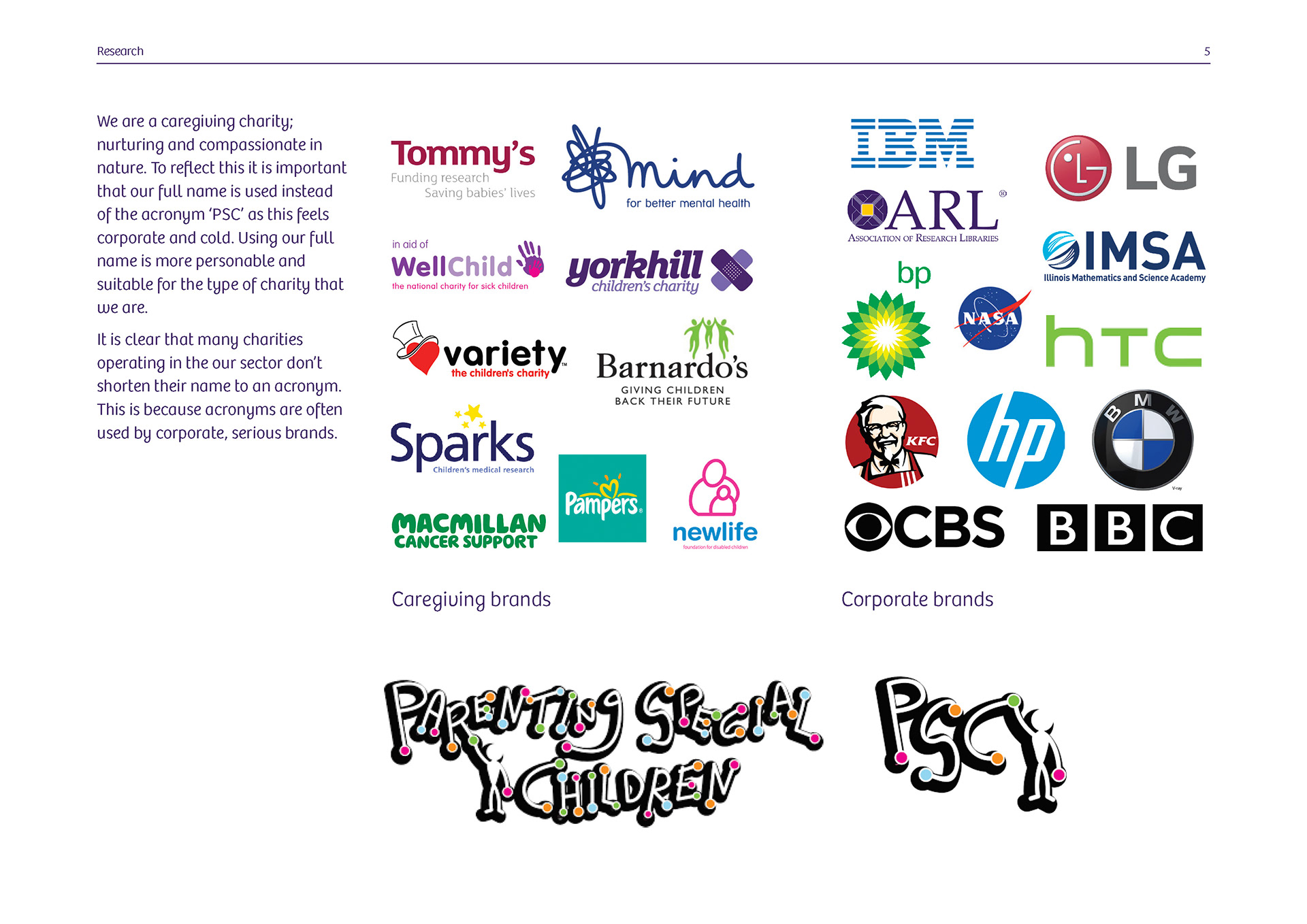
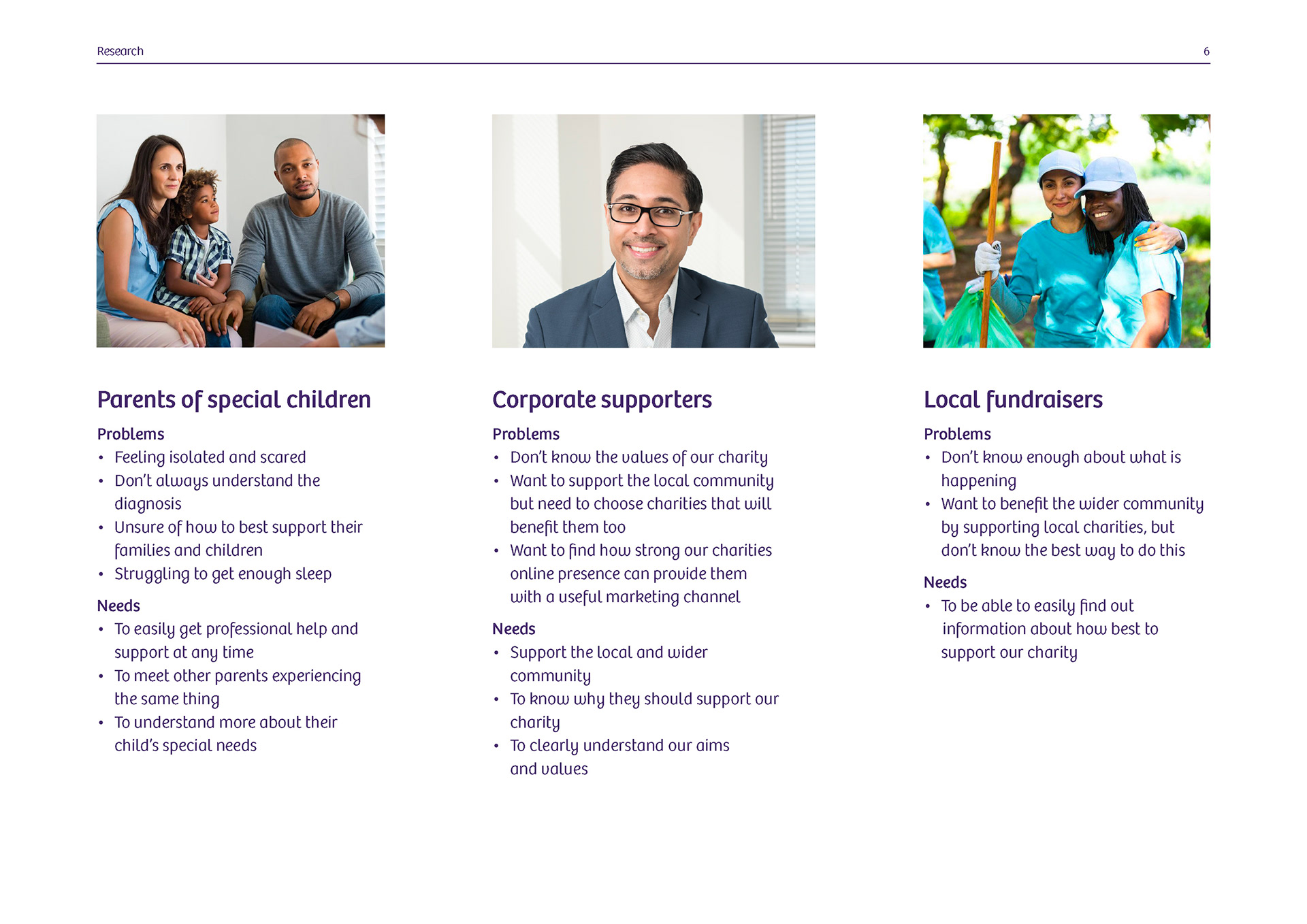
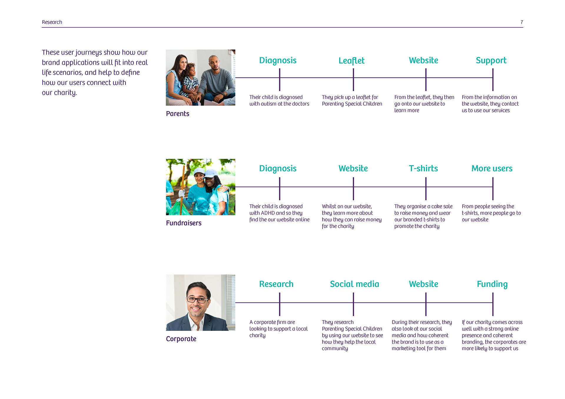
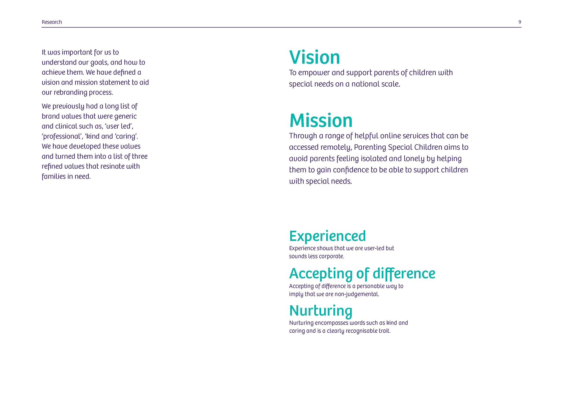
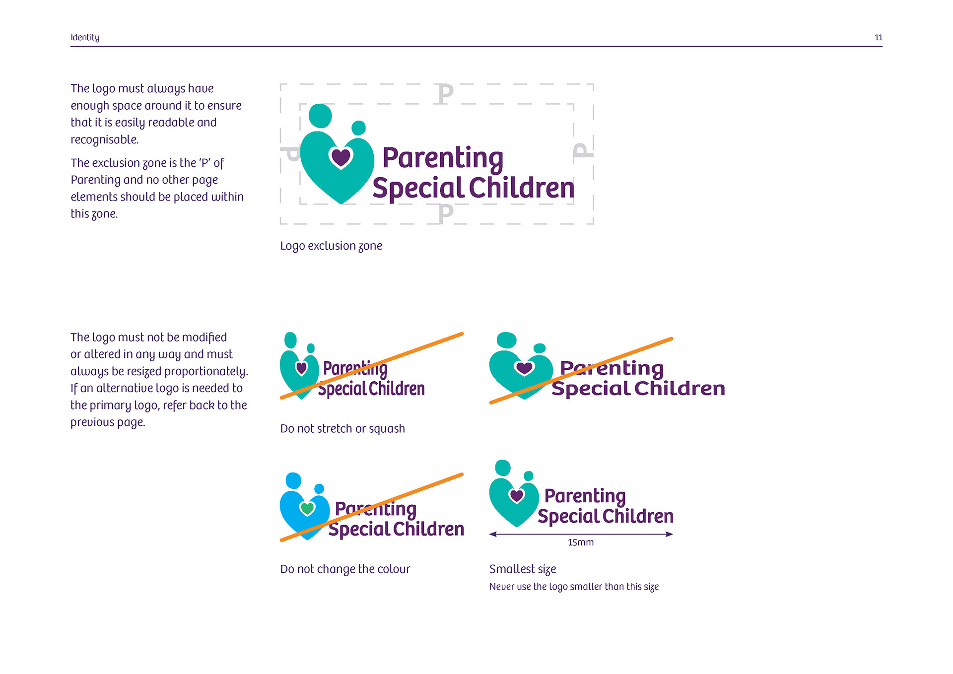
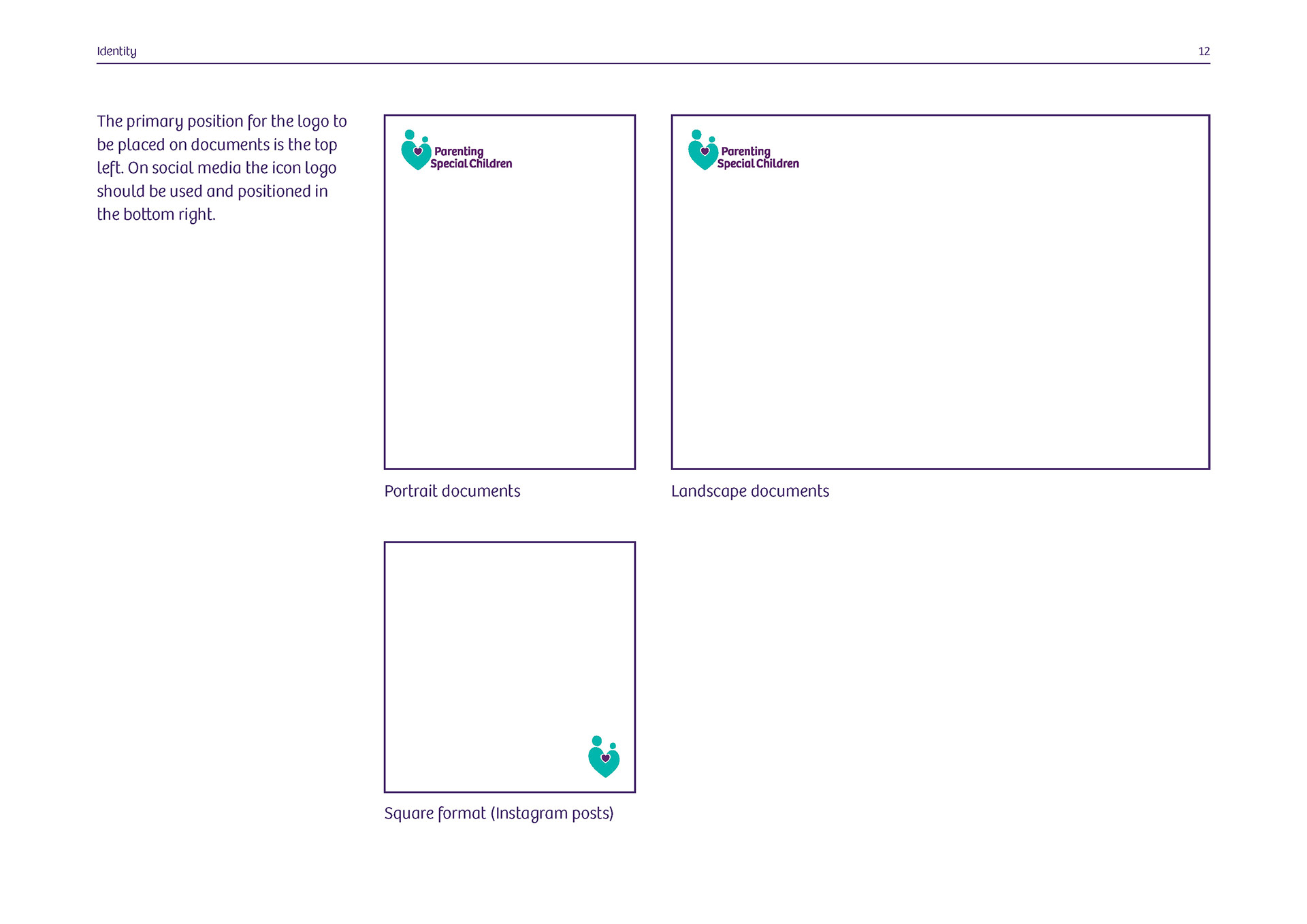
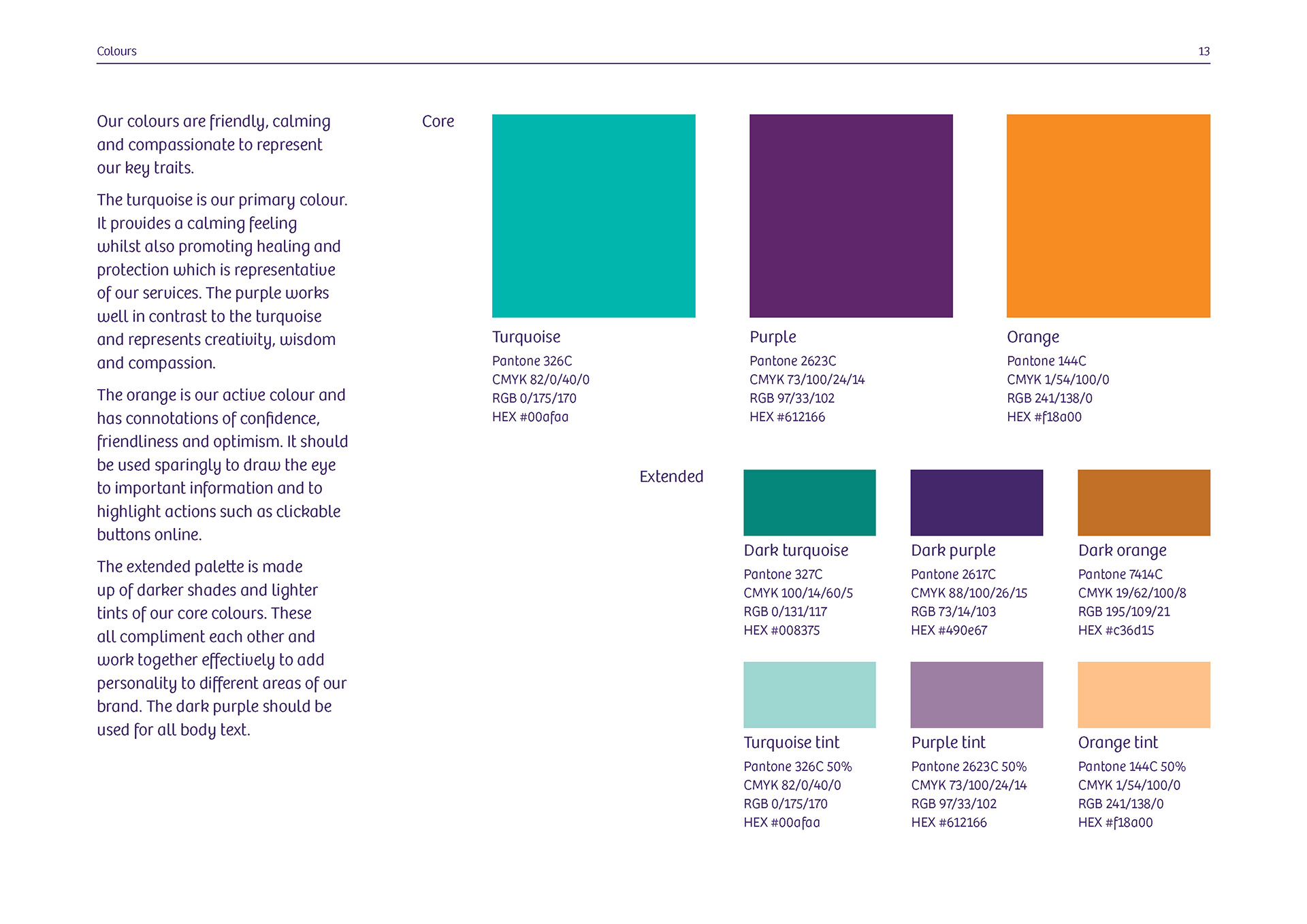
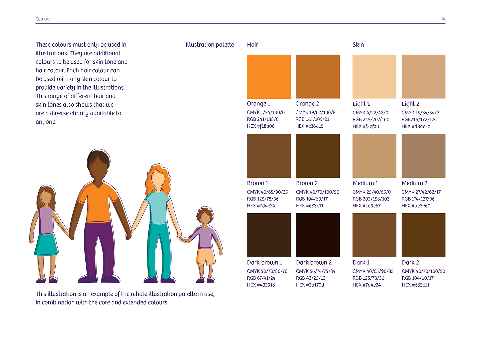
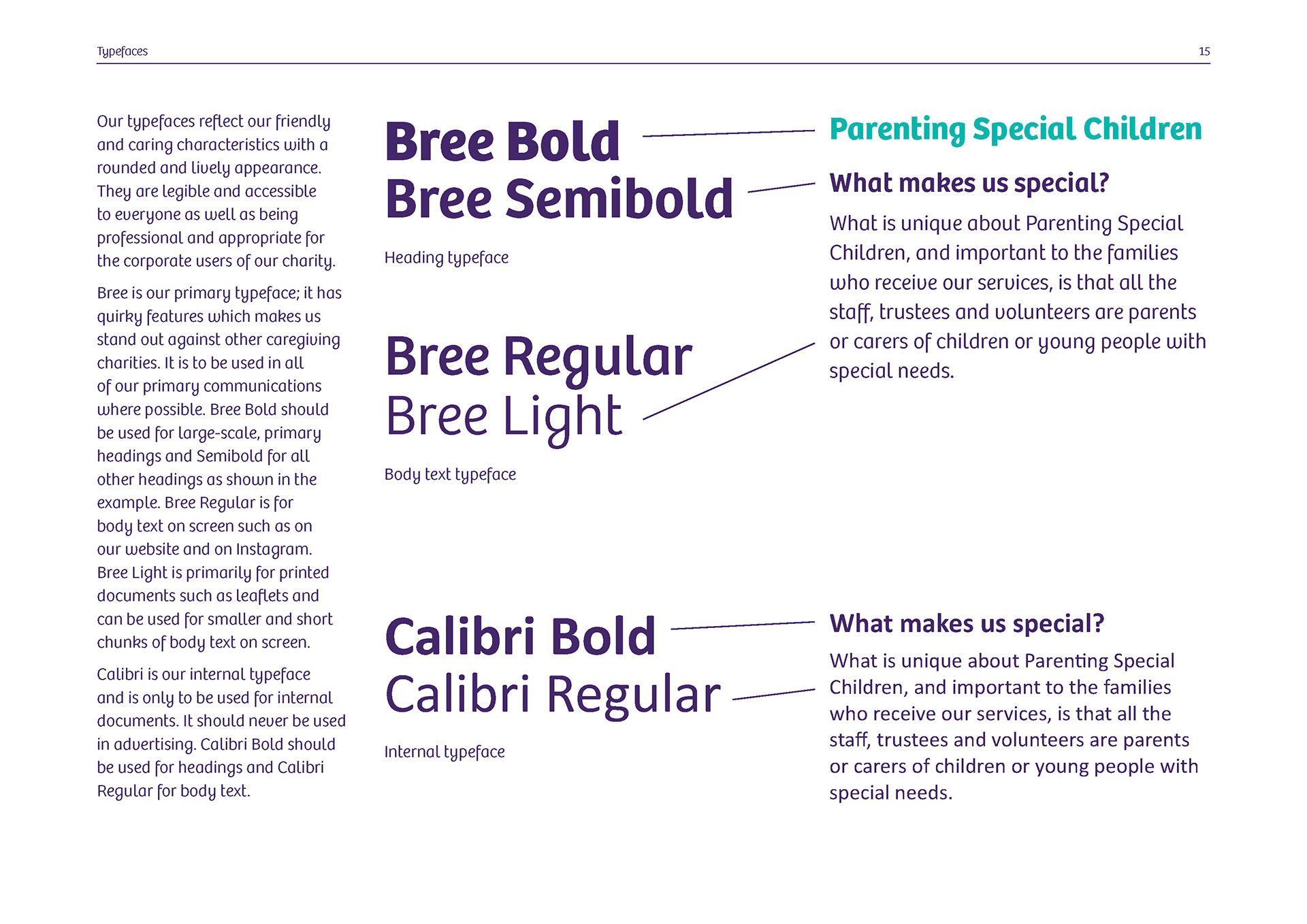
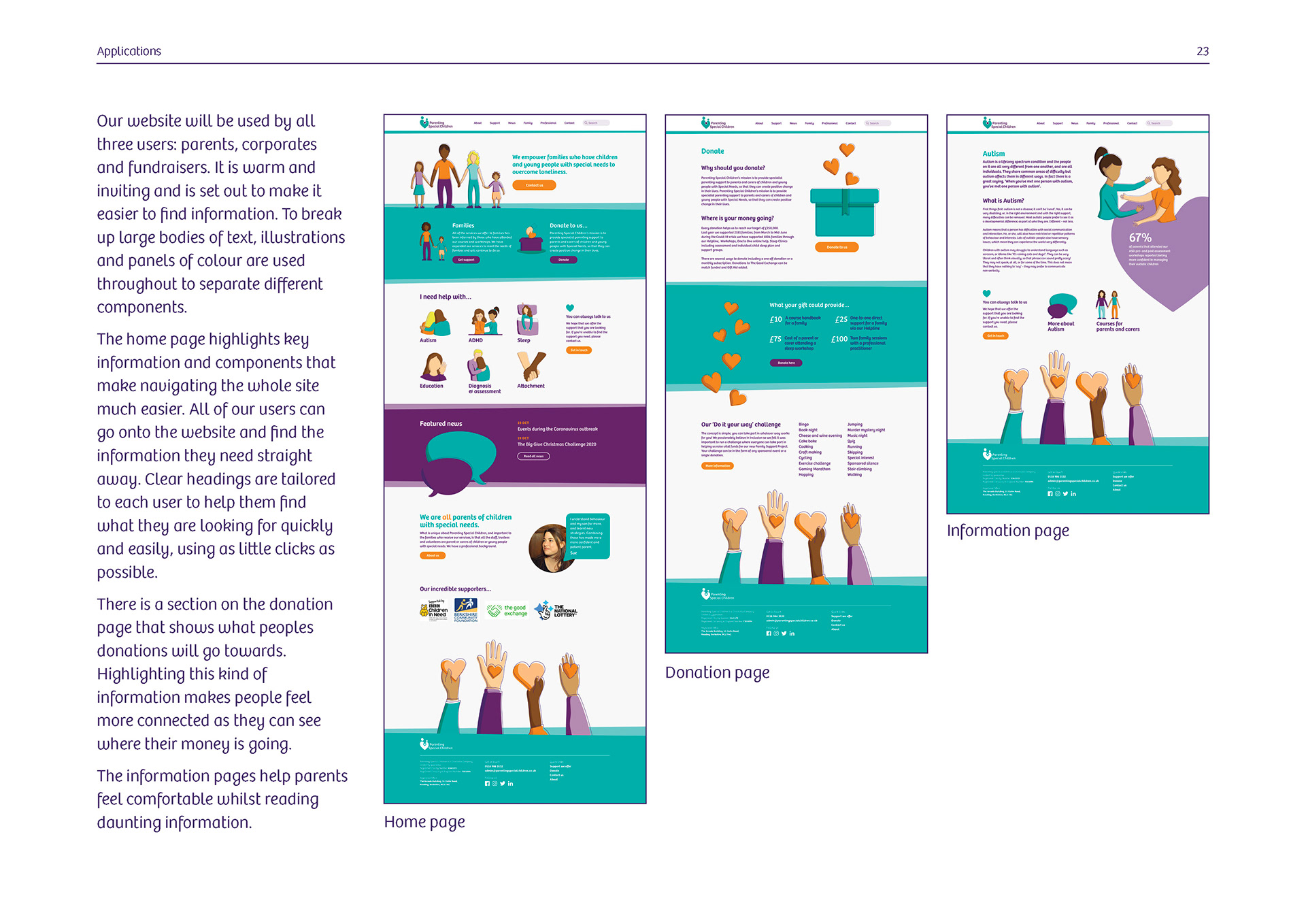
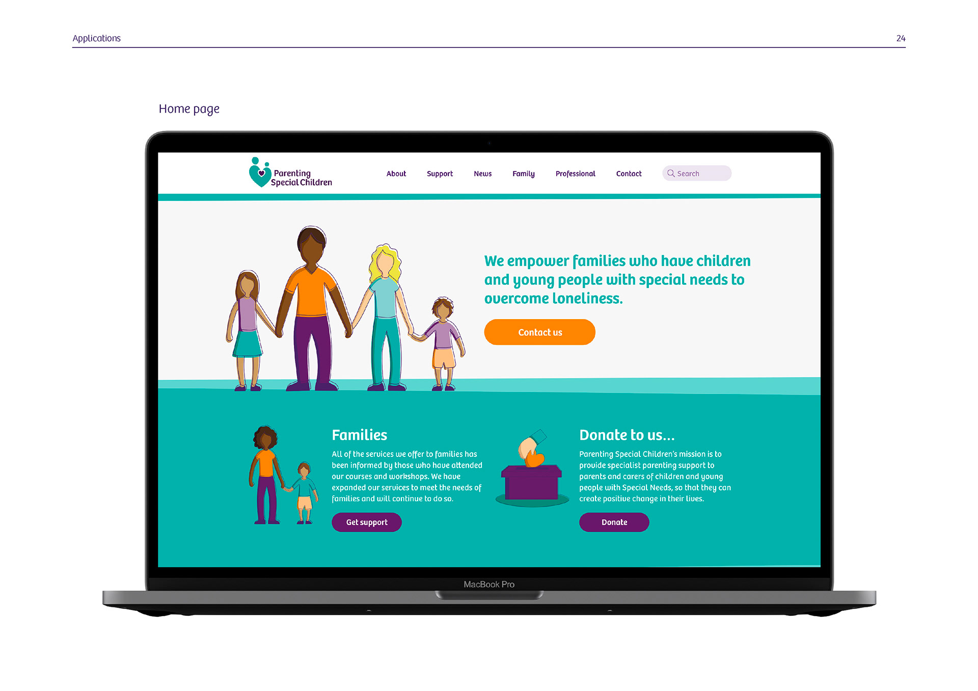
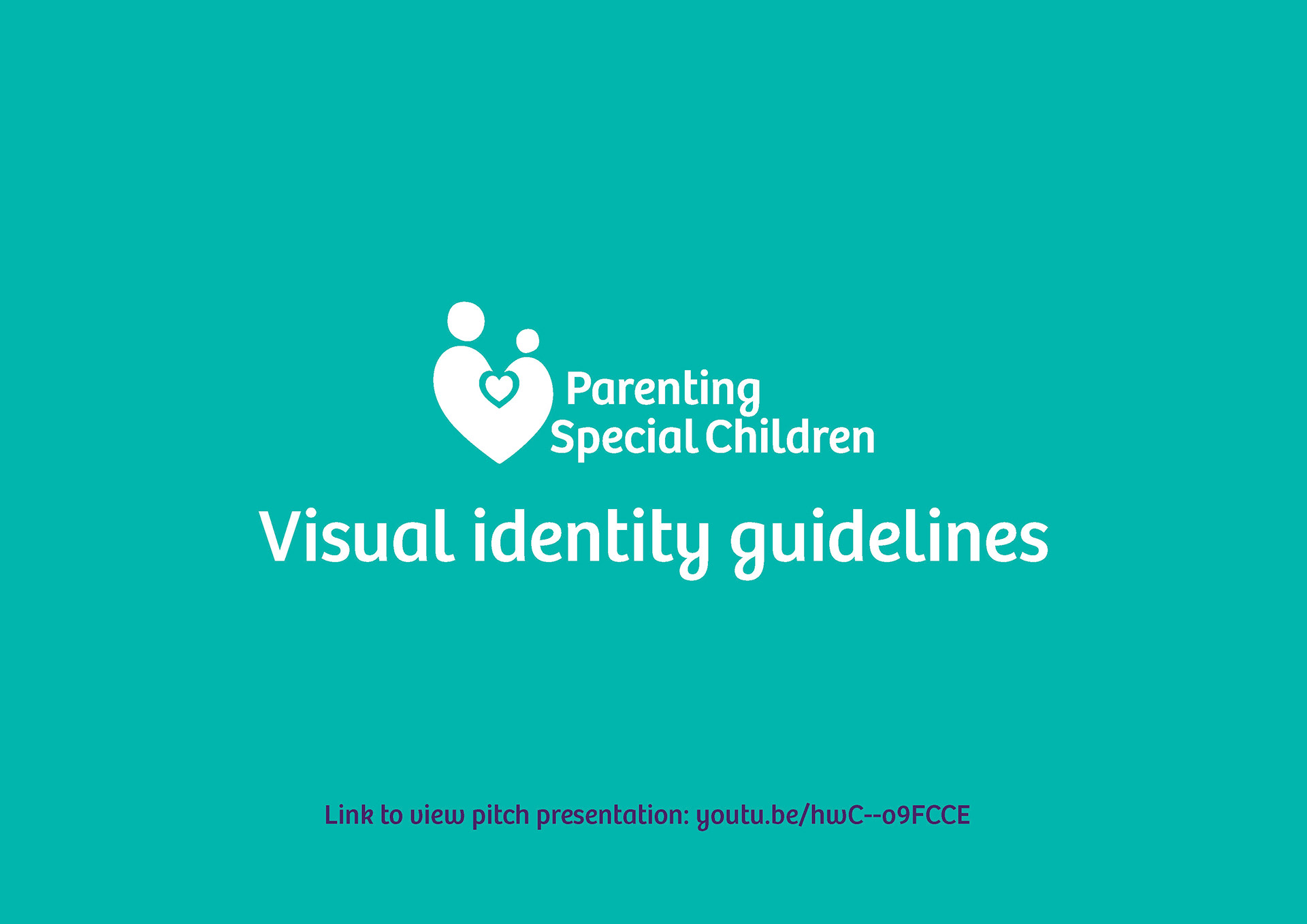
Our chosen charity 'Parenting Special Children' is an experienced charity founded over fifteen years ago, so understandably they were reluctant to try new and different design routes. As a result we carried out extensive research, meaning all of our design decisions are carefully thought out, with evidence as to why they will be successful. We also took into consideration our charities knowledge and understanding of design to ensure the visual guidelines were as simple and easy to follow as they could be.
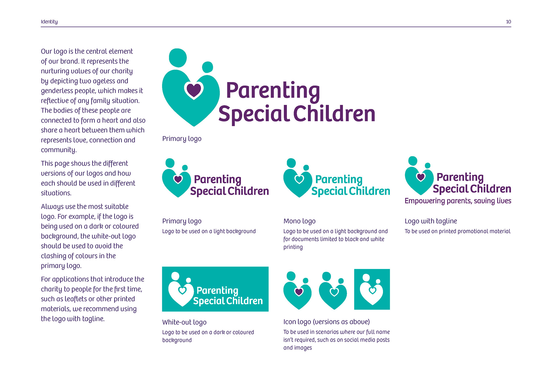
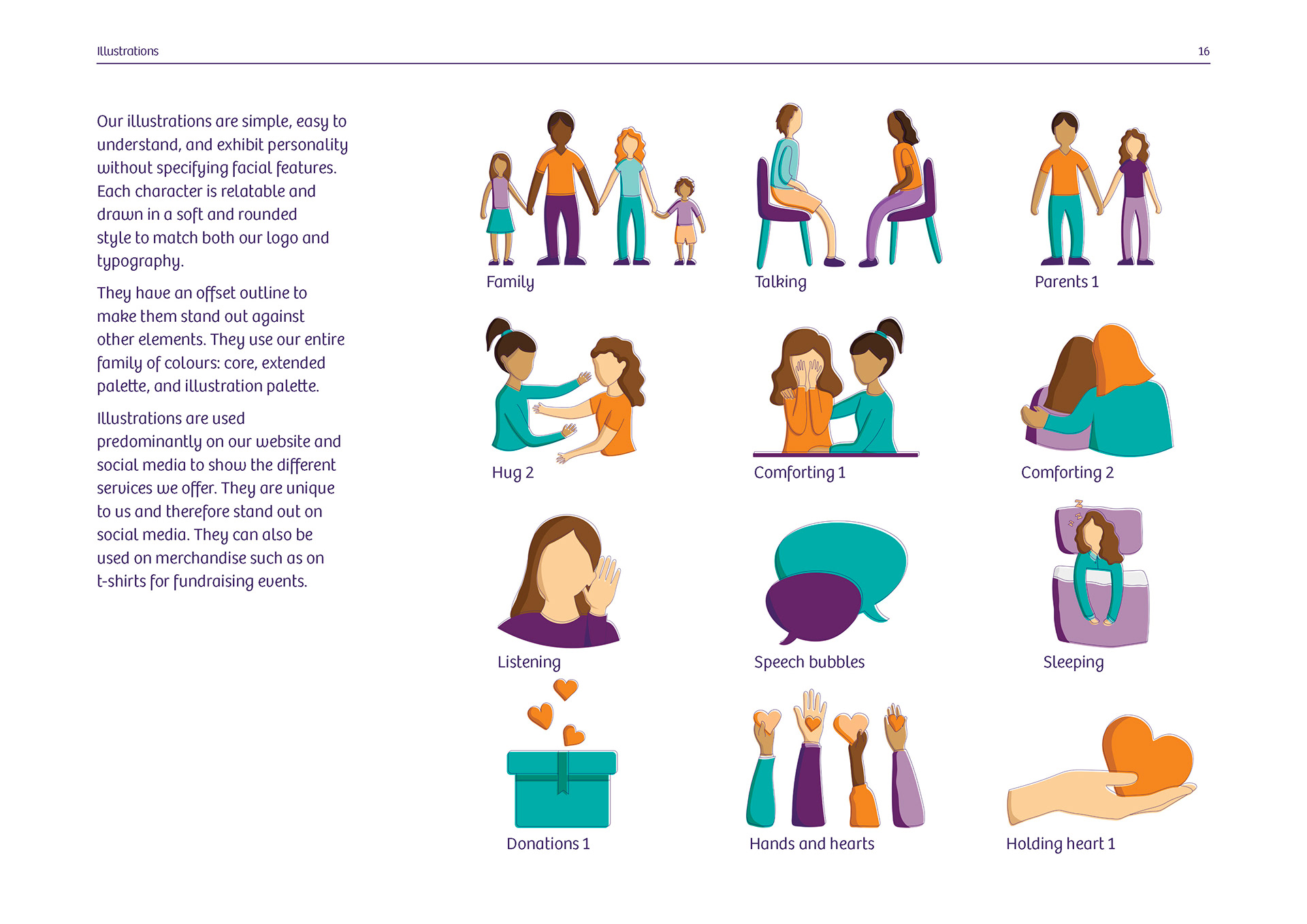
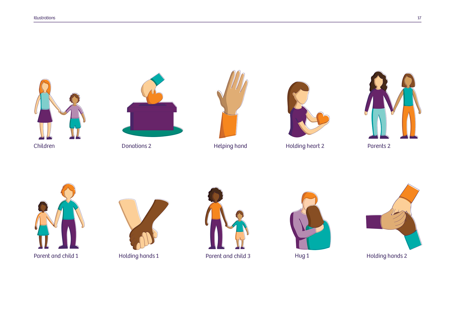
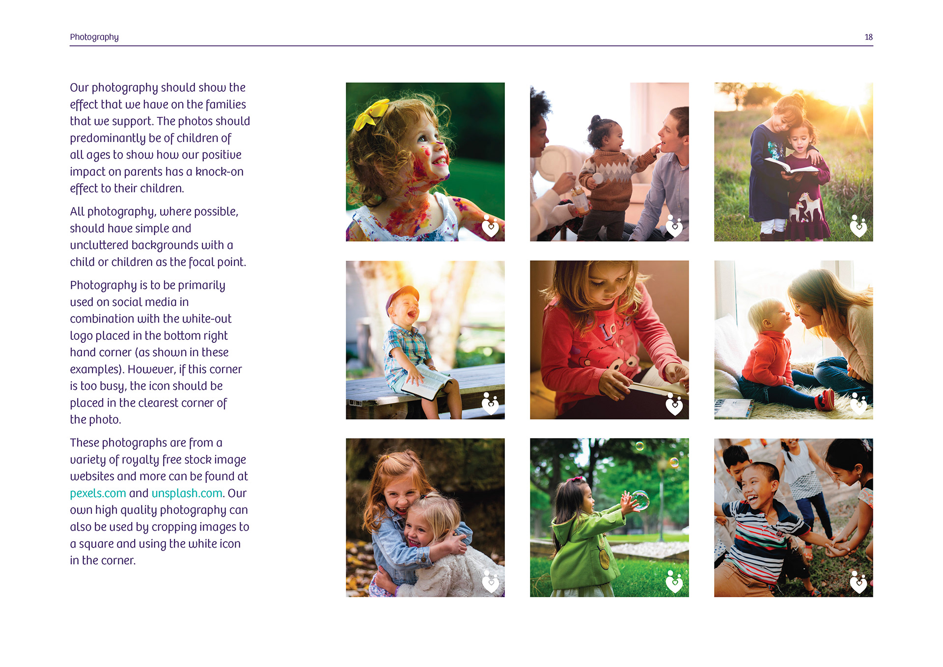
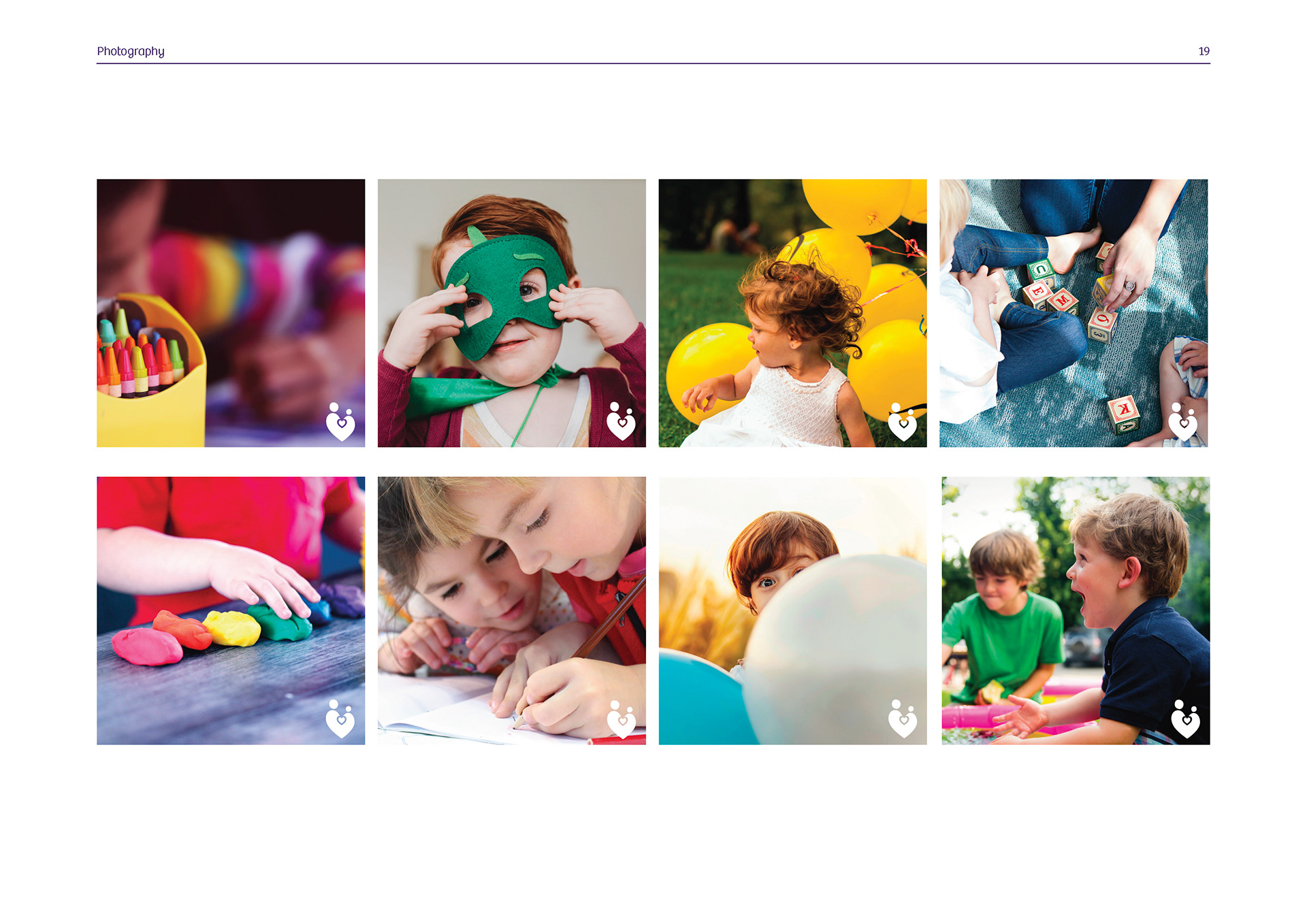
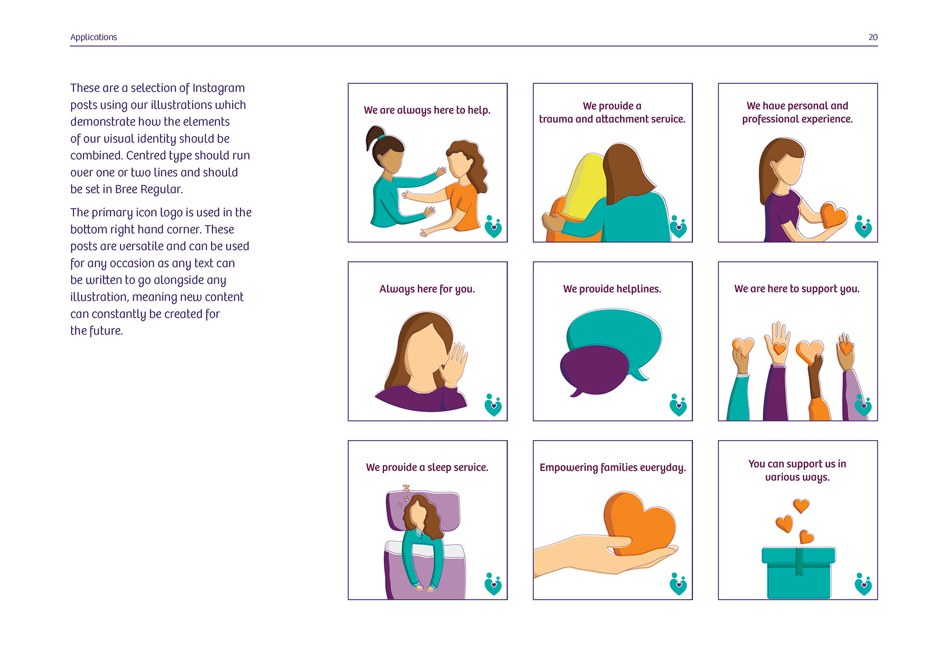
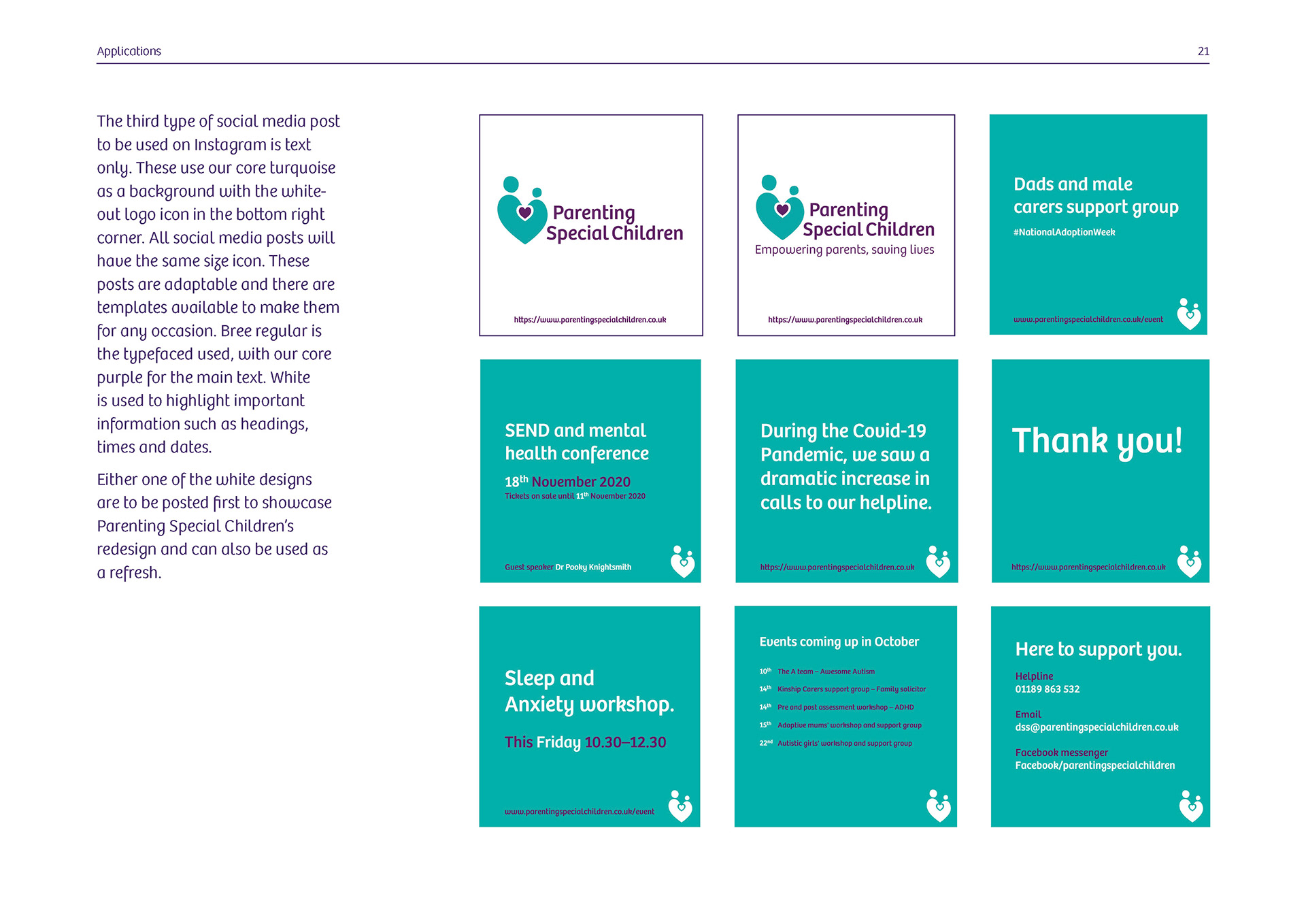
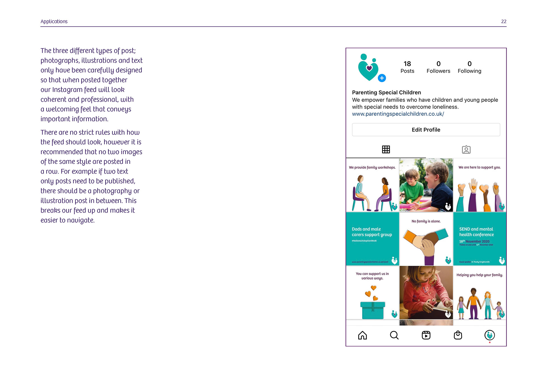
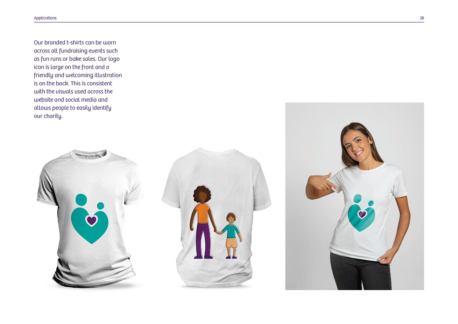
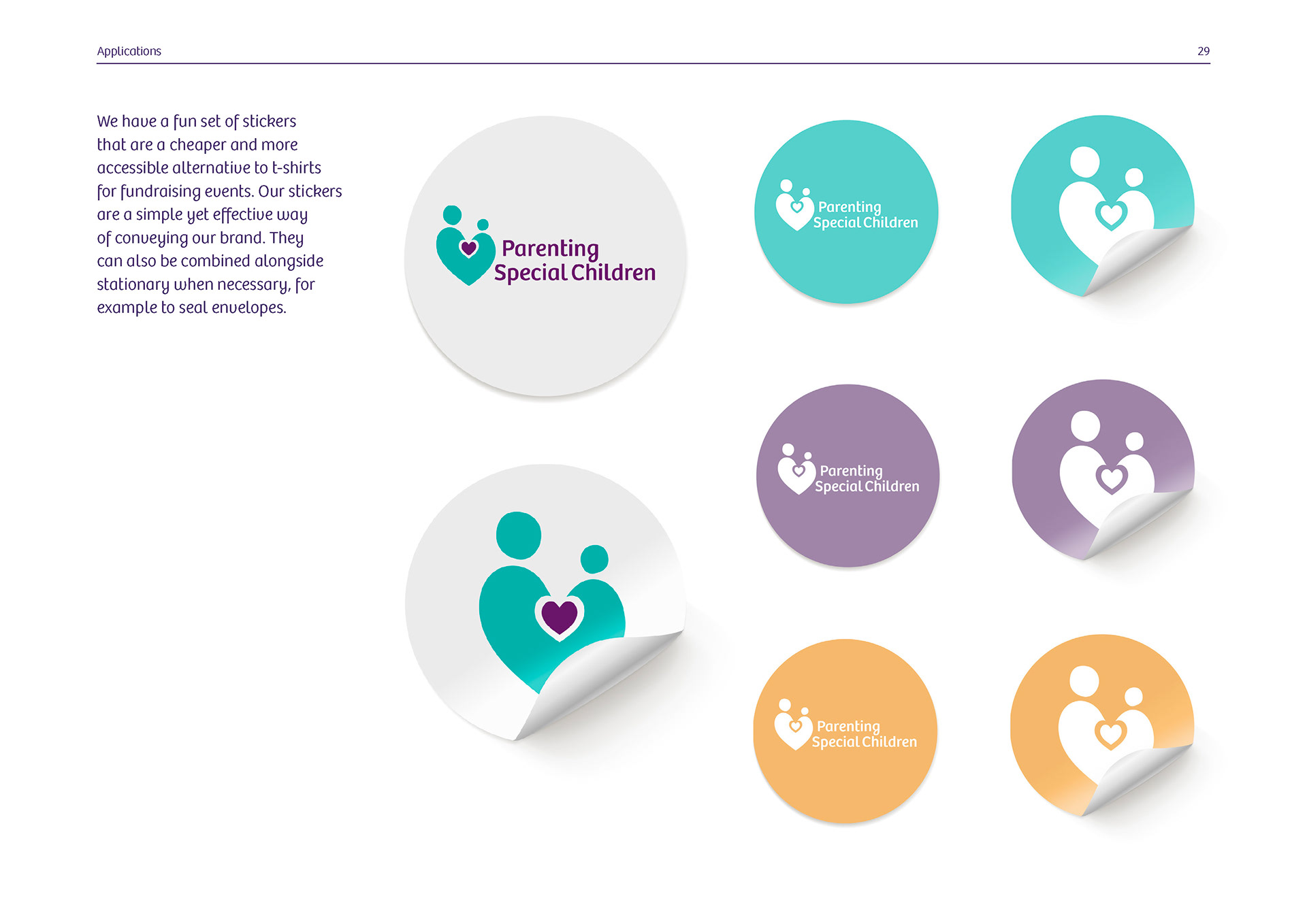
I had a large individual role in this project, I was in charge of creating the set of twenty two illustrations, and all three types of social media post, I also had a large part in the creation of the logo and chose our final typeface 'Bree' as well as putting the final pitch document together. We produced a virtual presentation the client could view as well as show to the rest of the team, in this we presented our research and designs, with justification for every decision.