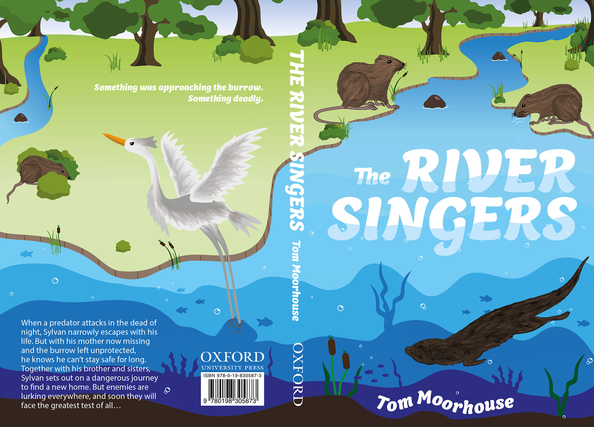
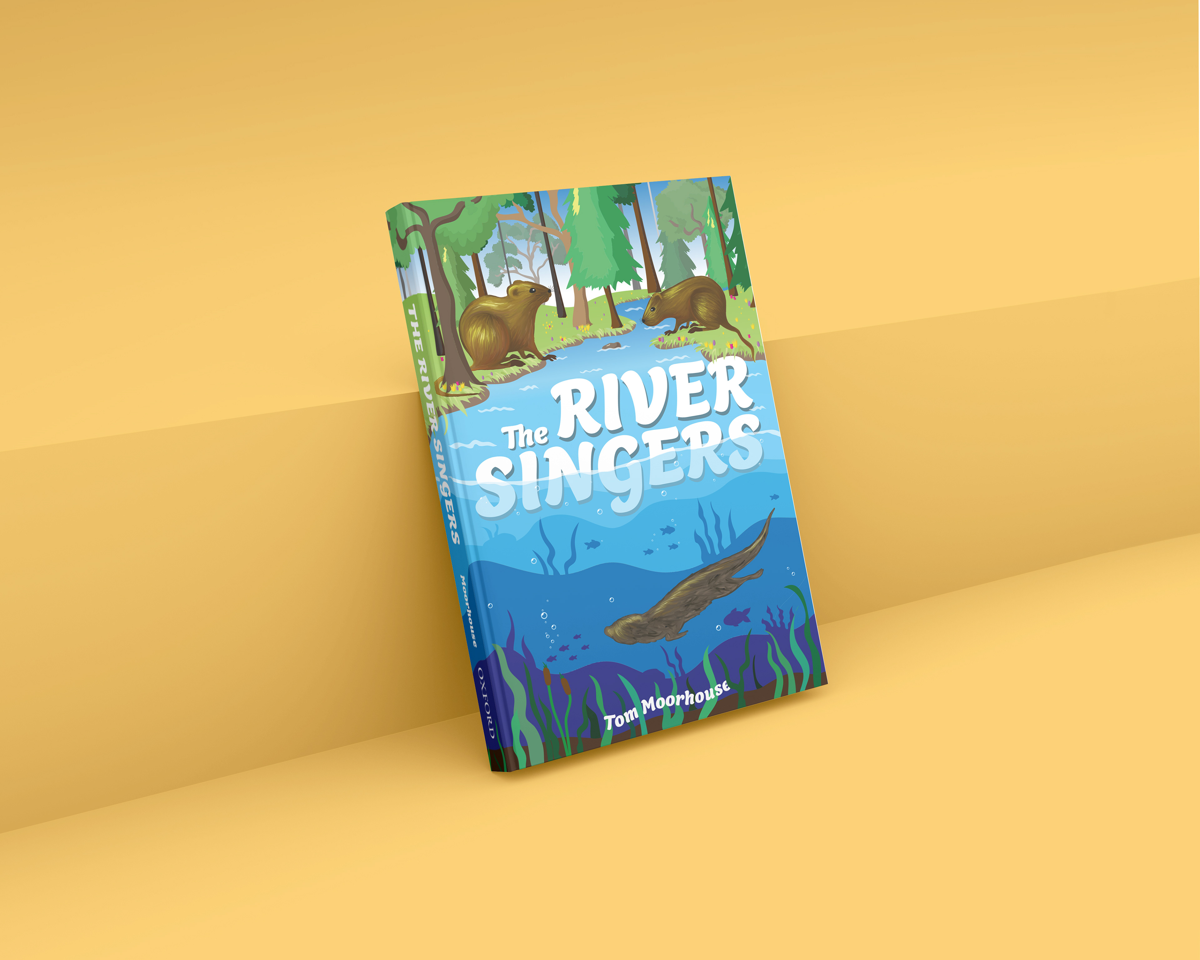
This project consists of a redesigned book jacket for the title 'The River Singers' by Tom Moorhouse. The target audience is children aged 9–11 years. My final design showcases the beautiful landscape depicted in the book alongside the water voles which are the heroes of the story, the villain in the story, an evil mink is lurking below the seemingly unaware water voles in the river. I produced all the artwork myself using a combination of hand drawing and digital work in Adobe Illustrator.
To reach my final book cover design I started by carrying out extensive research into children's books of the same age range and genre and looked at what makes certain covers successful. I also looked into the different animals and environments in the book to help come up with ideas. After completing research I started sketching initial ideas and drawings I thought would work and kept developing these using my own thoughts and feedback from others. I worked hard to improve the salience of the cover, particularly the type as well as create a sense of depth and realism in the background, while maintaining the illustrative style suitable for children. To add light into the cover and bring characters forward I added hints of yellow which I think works well.
Overall I thoroughly enjoyed designing book covers for OUP and would be open to work on more in the future as I love the creativeness they bring as well as a challenge.
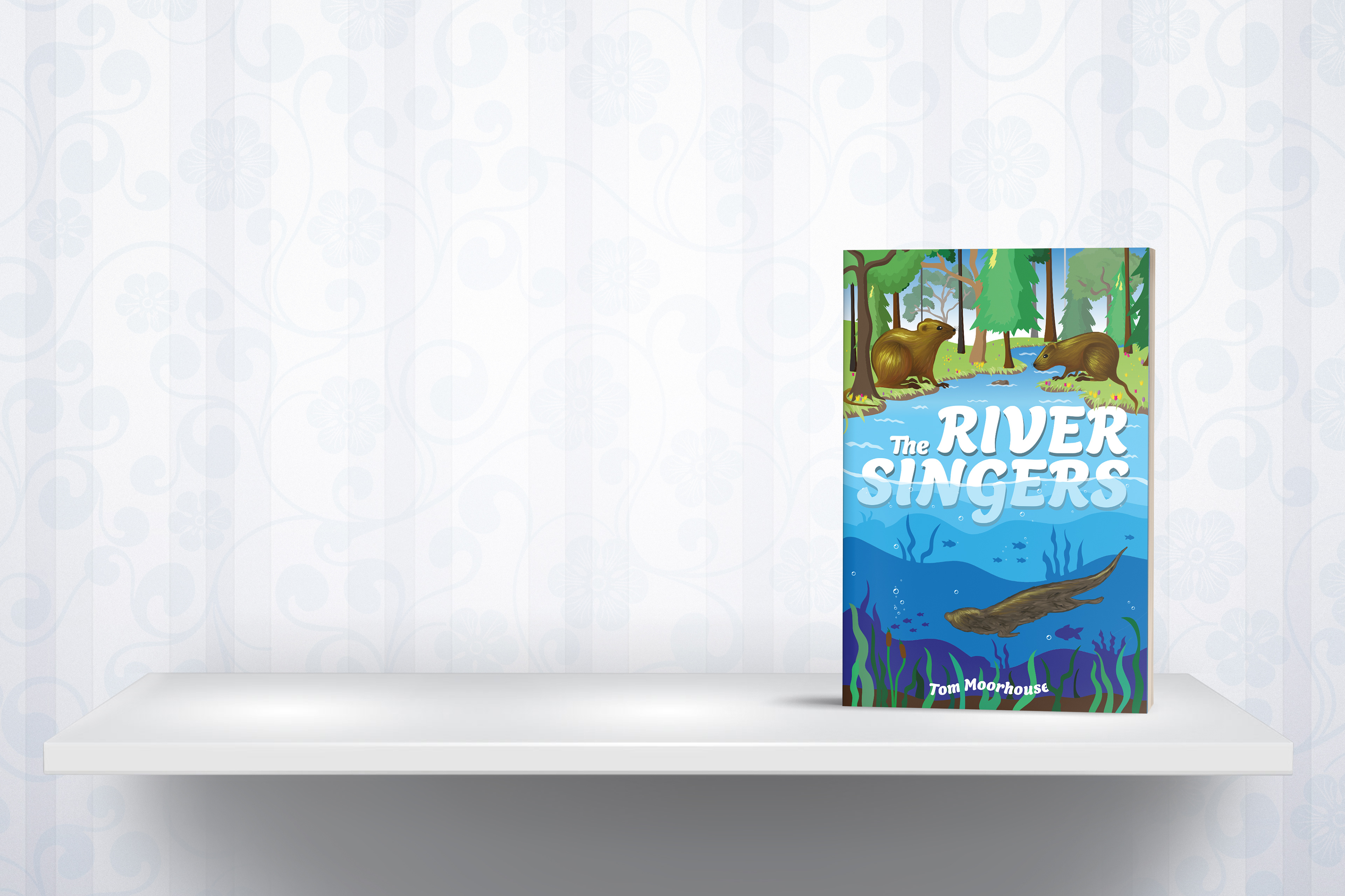
Final book cover design.
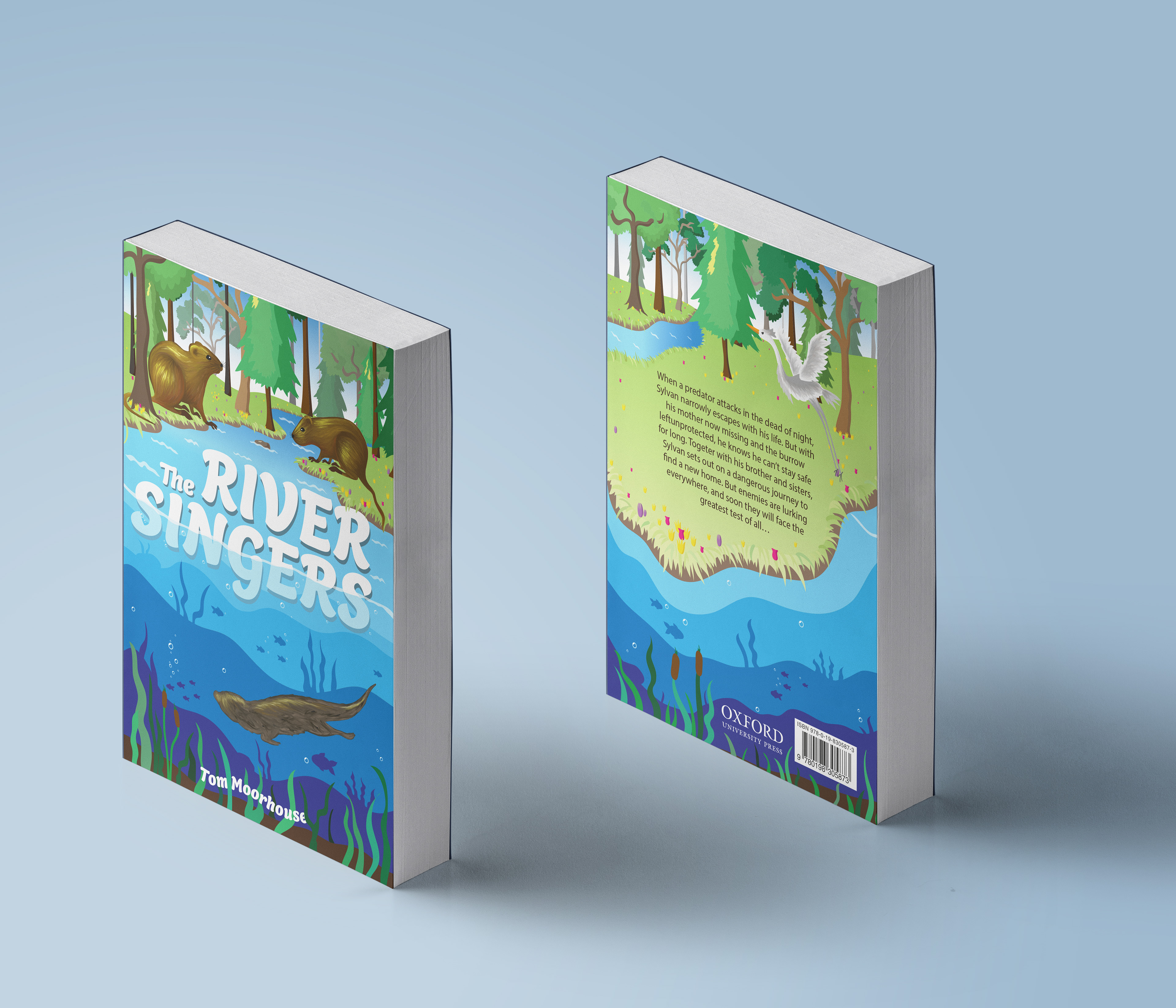
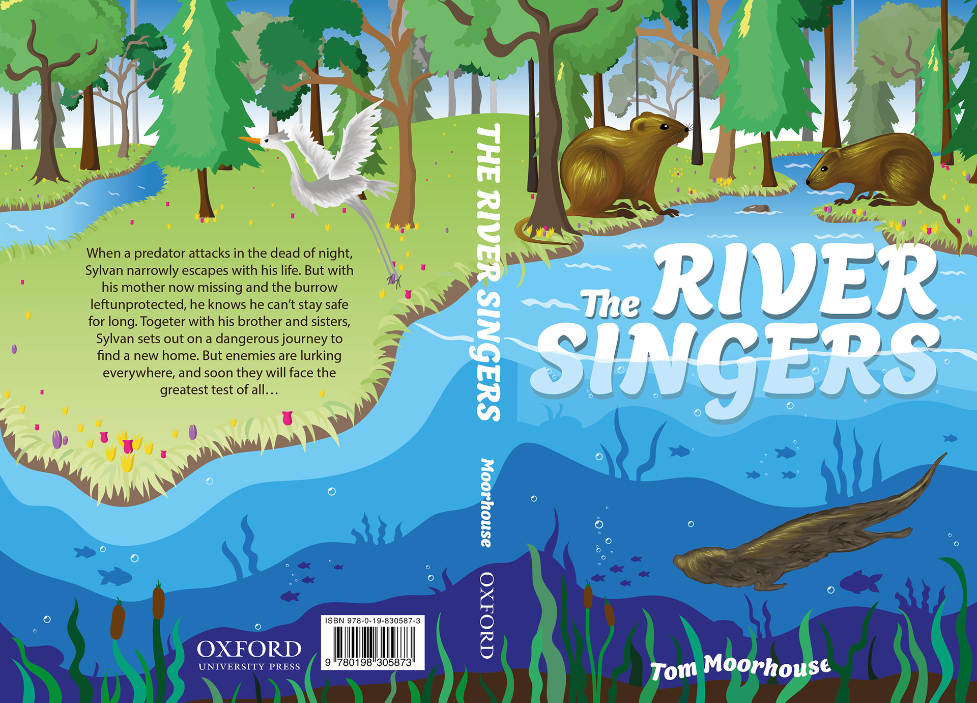
I was lucky enough to be able to resubmit this project, the cover on the right is the original cover from my first submission. As you can see the concept and illustration style of the cover remains the same, however I worked hard to improve the overall look and make the cover stand out which I think has paid off. I re-drew the composition of the landscape and added more depth, I also added more detail and colour, to not only brighten up the cover but also give a more realistic environment. Additionally I have improved the salience of the main text to make it stand more, as well as reposition the blurb so doesn't look like its falling off the page.
I learnt the importance of listening to feedback in this project which I think really helped me to progress, I ended up changing things I was reluctant to do at first, for example added more colour to the water voles on the front cover which really emphasises them.