Each year the Department of Typography and Graphic Communication at the University of Reading holds a degree show, exhibiting graduating students’ work to potential employers, clients, family, friends, and other individuals related to the design industry. This is usually held in the Department as a physical event where visitors can look at work and talk to students face-to-face. However, due to the COVID-19 pandemic, a physical event was not possible when I graduated so it was up to the students to make a virtual event that can replicate the physical exhibition as best as possible. I was a part of this team of 6 students. I wanted to contribute as this event is incredibly important to the graduating students as it signified the end of the course and provides opportunities for networking and employment. The aim was for the degree show to be just as successful as it had been in the years before the COVID-19 pandemic.
‘As designers at Reading, we create real solutions to real problems. Researching, re-examining, rethinking, and redefining those problems is essential to our approach. Rigorous planning is behind everything; it's our baseline. We think, we think again; never settling for our first ideas. The considerations of users, viewers, and readers are at the heart of everything that we do. We value precision and care for every element on the screen or printed page, whether visual or verbal. We pay attention to every mark, character, and space.’
Research
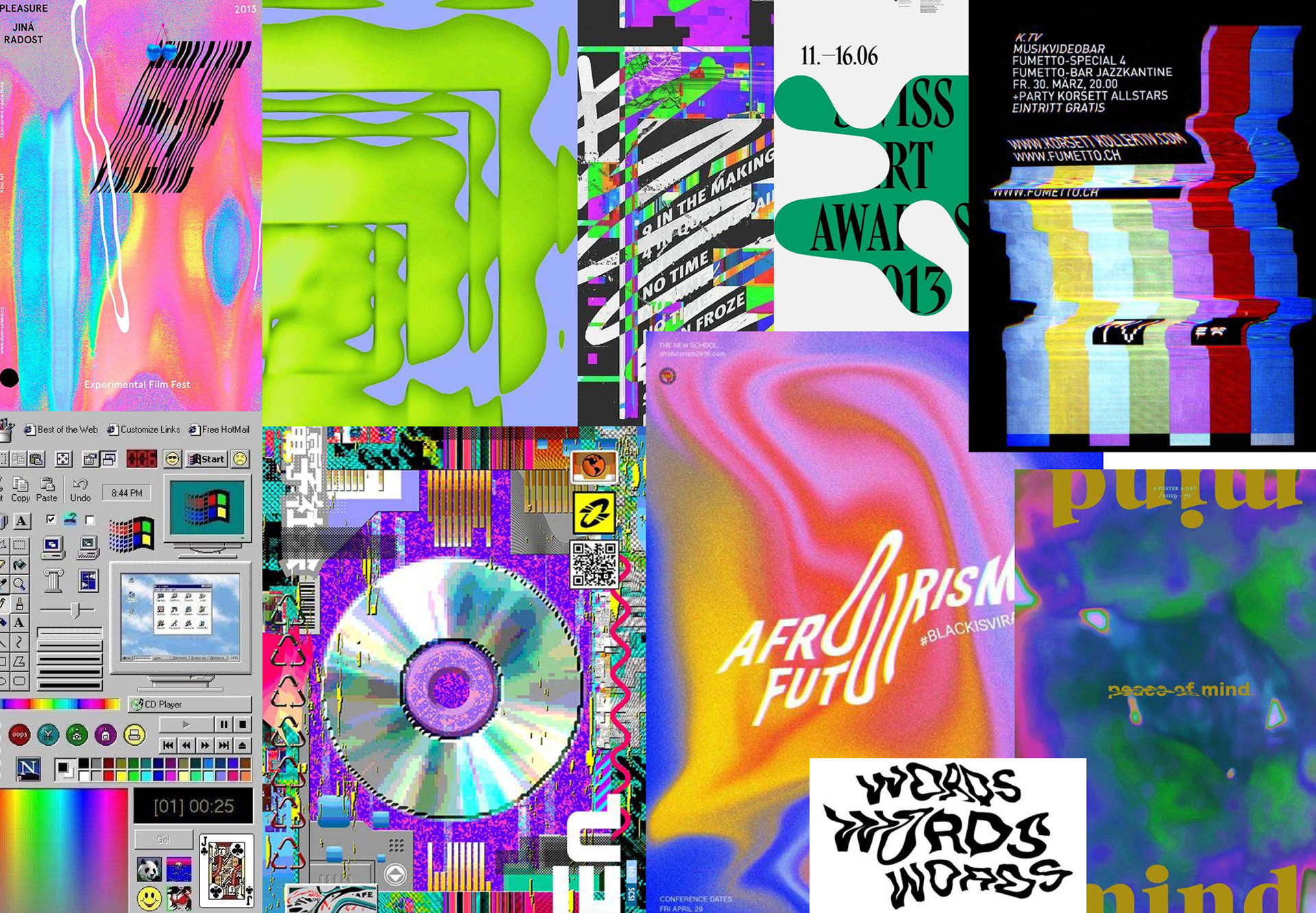
Our primary research involved looking at existing degree shows: online degree shows in general, and University of Reading degree shows from the past three years. Some art degree shows, such as that of Blackpool School of Arts [https://kuula.co/post/7K8xl/collection/7lsL8], were highly professional and featured interactive websites, which allow you to virtually walk around in a space as if it were a physical display. We found this intriguing, yet we deemed this to be outside of our budget and our expertise and also ineffective.Last year’s Typography degree show [https://greater-than-a-to-z.co.uk] consisted solely of a website and social media presence due to the COVID-19 pandemic. However we agreed that it would be an advantage to still host an event, alongside the online presence, to further the interaction, engagement and normality of the show.
In relation to our most important deliverable alongside the event – the website – we created user personas to reflect our most fundamental users, in order to shape what the website would need to do. We came up with a list of users: students, employers, lecturers, family, potential applicants to the course, and people that encountered the site at random. Evidently, the main goal of the website was to act in place of a physical room of work, and therefore our users primarily had the common goal of browsing the work in different ways, e.g. by student or type of design.
Identity
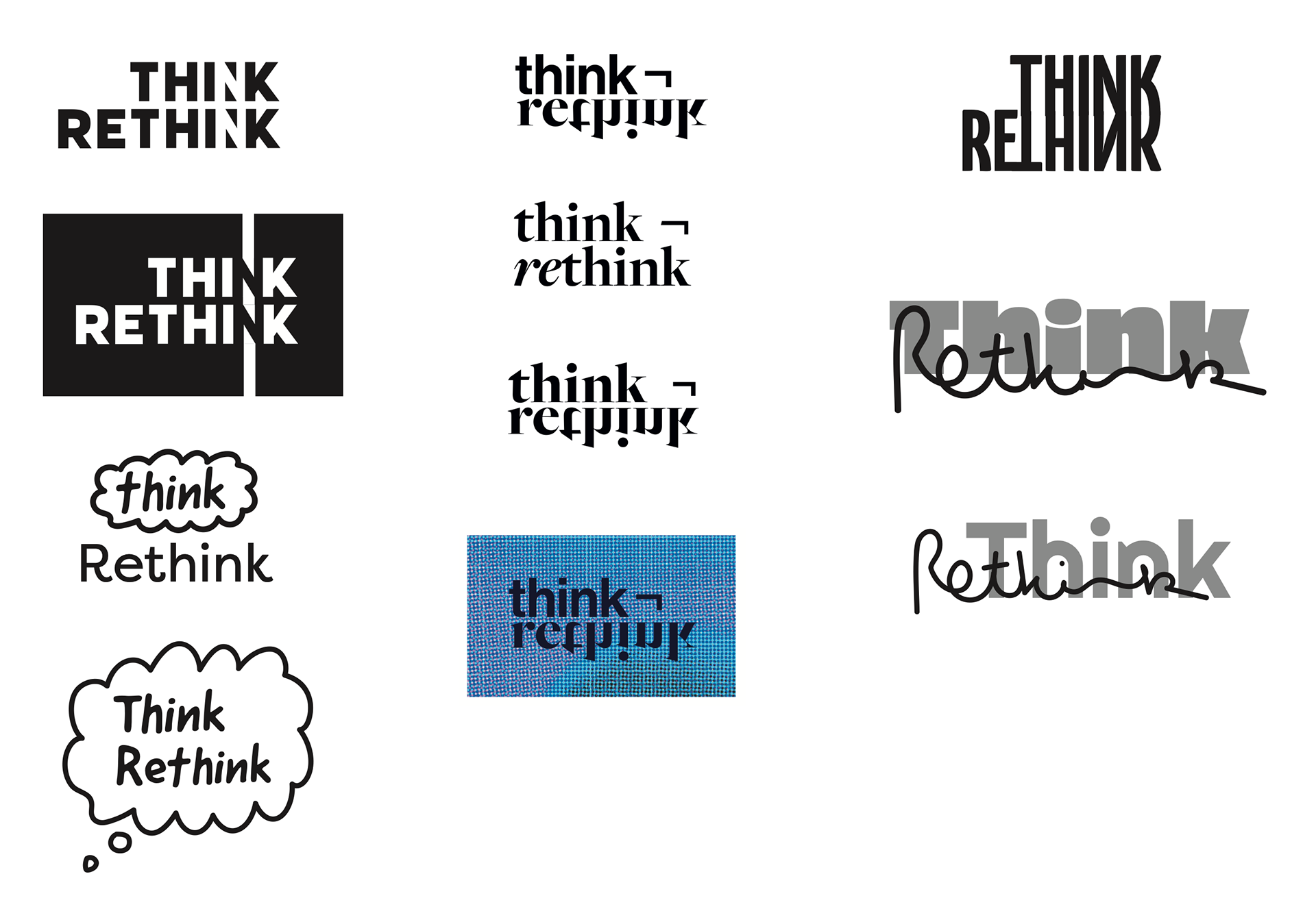
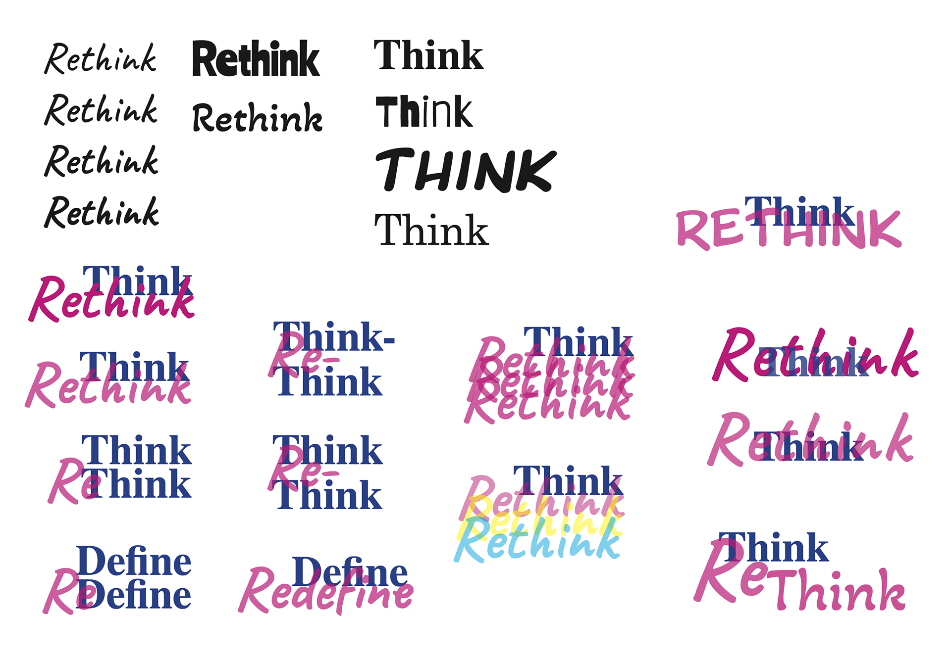
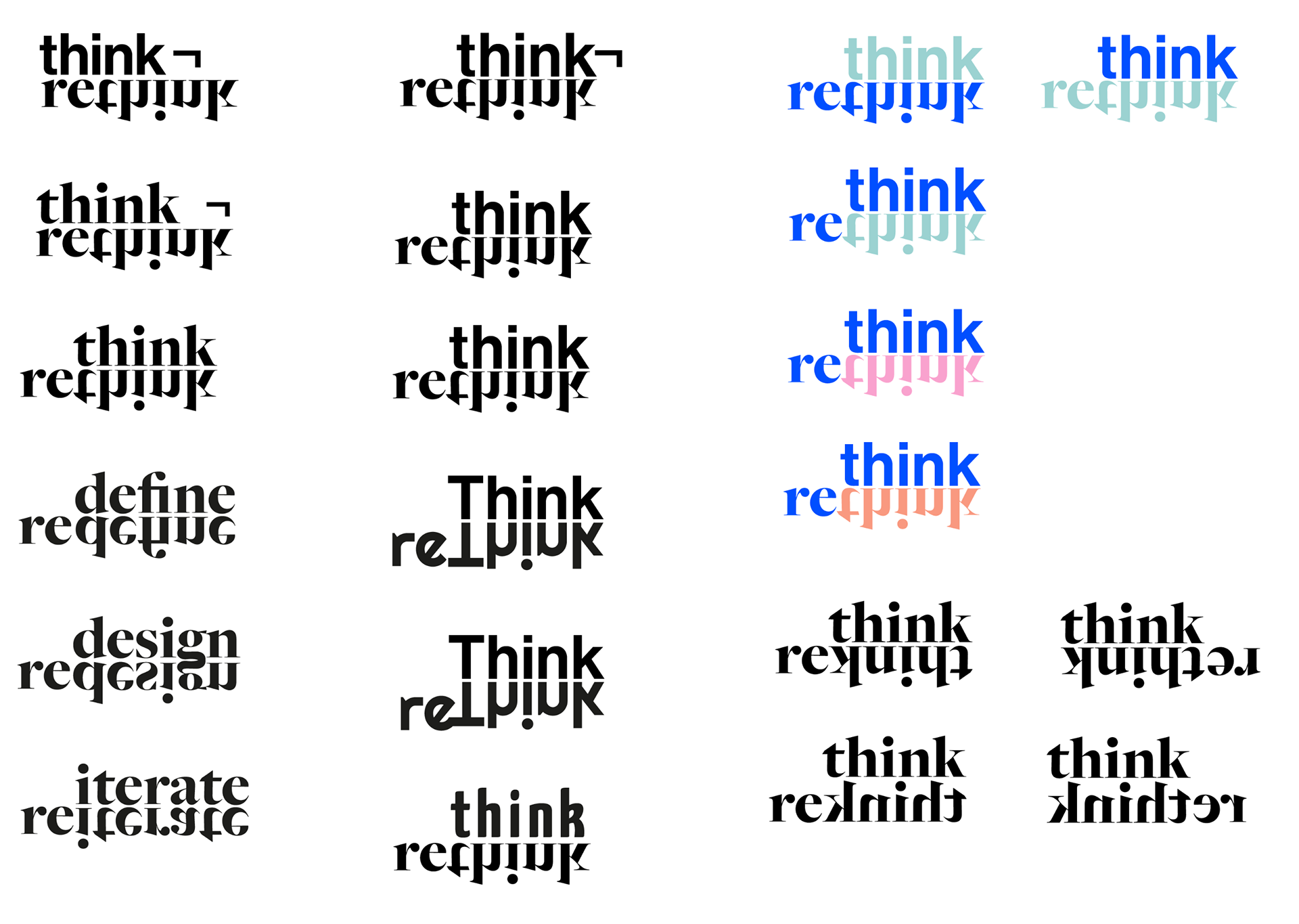
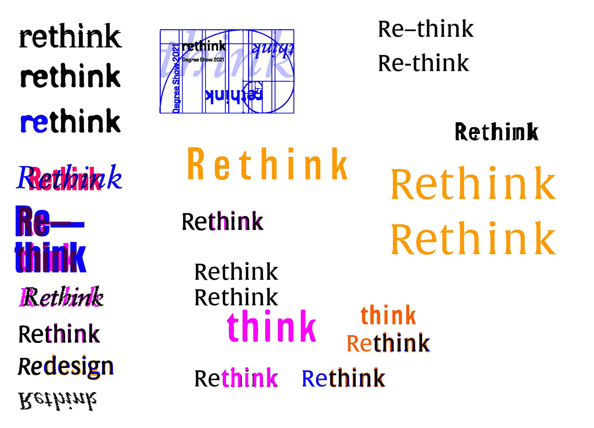
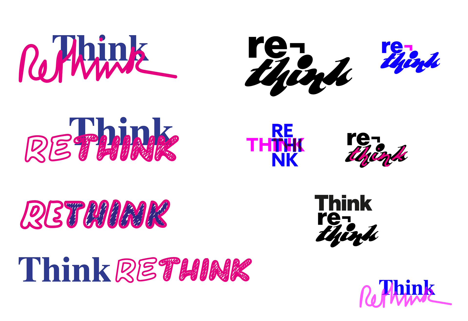
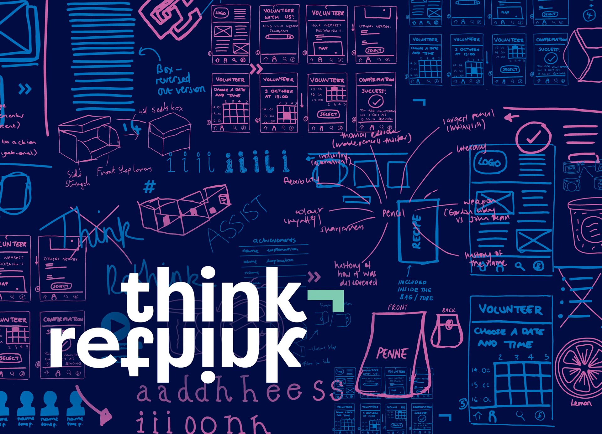
We came up with the name ‘Think Rethink’ as we felt it linked well to the Department and what we do as students. We wanted to show the in-depth process we go through to produce final pieces of work at Reading and what goes on behind the scenes. We found this theme to be a great way to give the visitors an insight to the work that goes into each project and how as Reading students, we are constantly testing, reworking and planning for our project work. We all had similar initial ideas of what the overall visuals could look like for this theme, which included a rather colourful, messy, and almost 90s retro vibe. We worked together to narrow down which designs we liked and choose our favourite ideas.

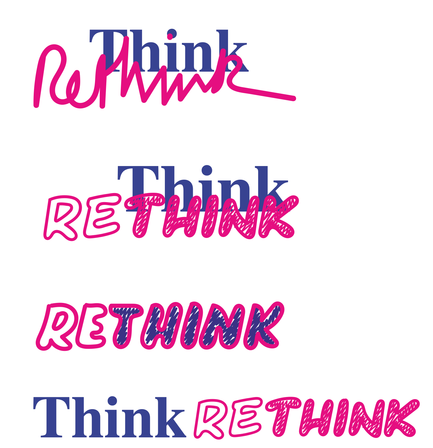
Logo
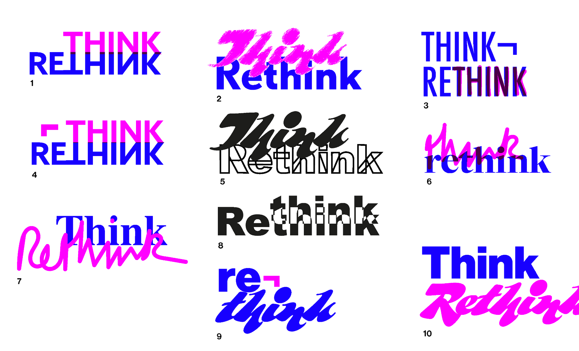
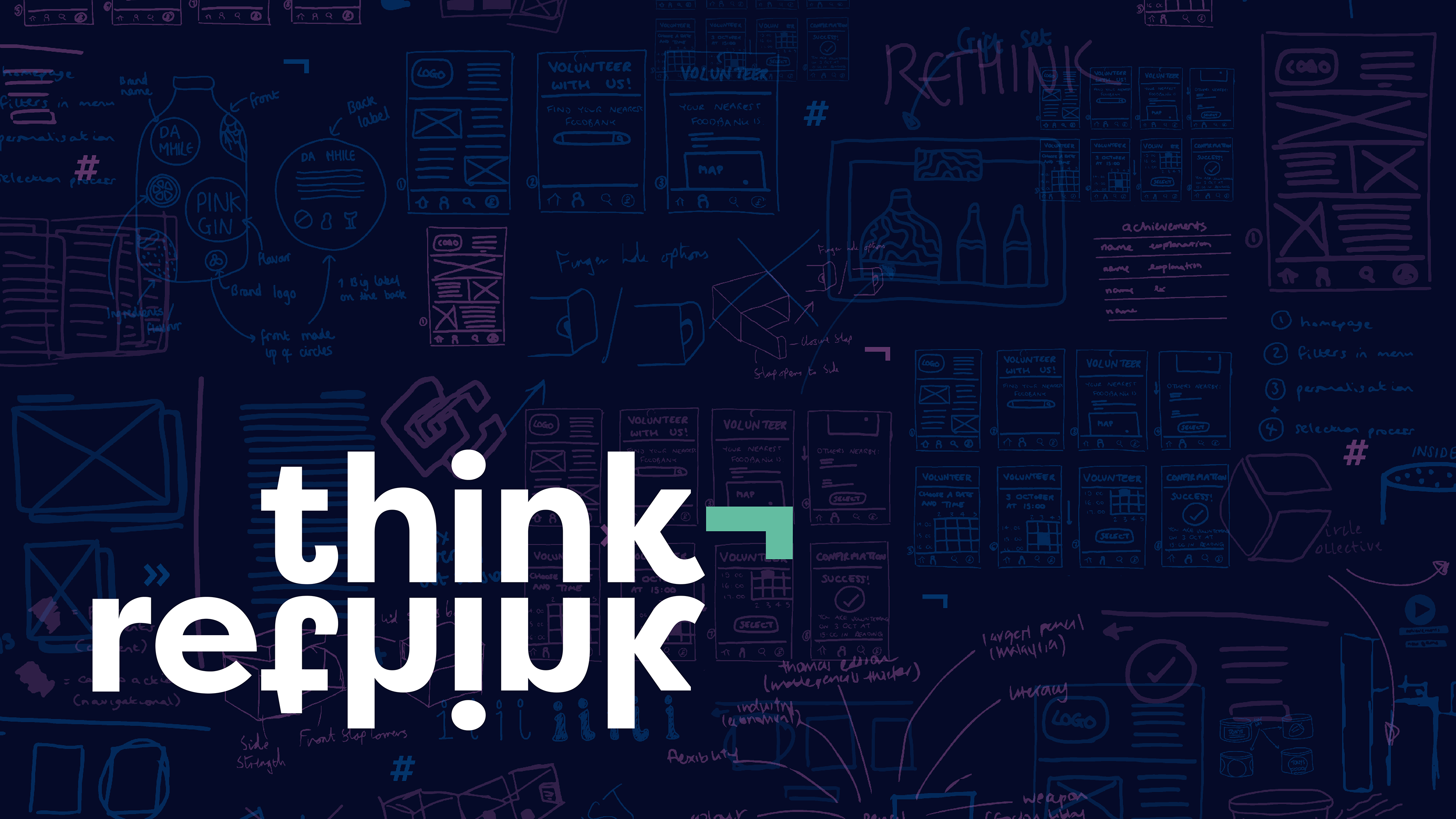
Our initial logo ideas included use of handwritten type, grids and contrasting colours to connote the concept of rethinking and reworking the logo itself. However, these felt messy and had low legibility. We needed our logo to work well across platforms and feel balanced. As such, we made iterations of the name ‘Think Rethink’, stacked to create a more solid shape that felt more confident and more like a logo. We liked the idea of using a visible shift return character to link the words together (a character that would usually be hidden, and perhaps unfamiliar to non-designers). We also tried using a tab character in the logo, but after gaining feedback from our client and supervisors, we settled on using a shift return symbol as this was more conceptually appropriate to the idea of an iterative process – indicating a break or refresh between the ‘think’ and the ‘rethink’, whilst also visually connecting the two. Hidden characters were an element that we carried forward dominantly in the visual identity in order to highlight that we care for the smallest of details.
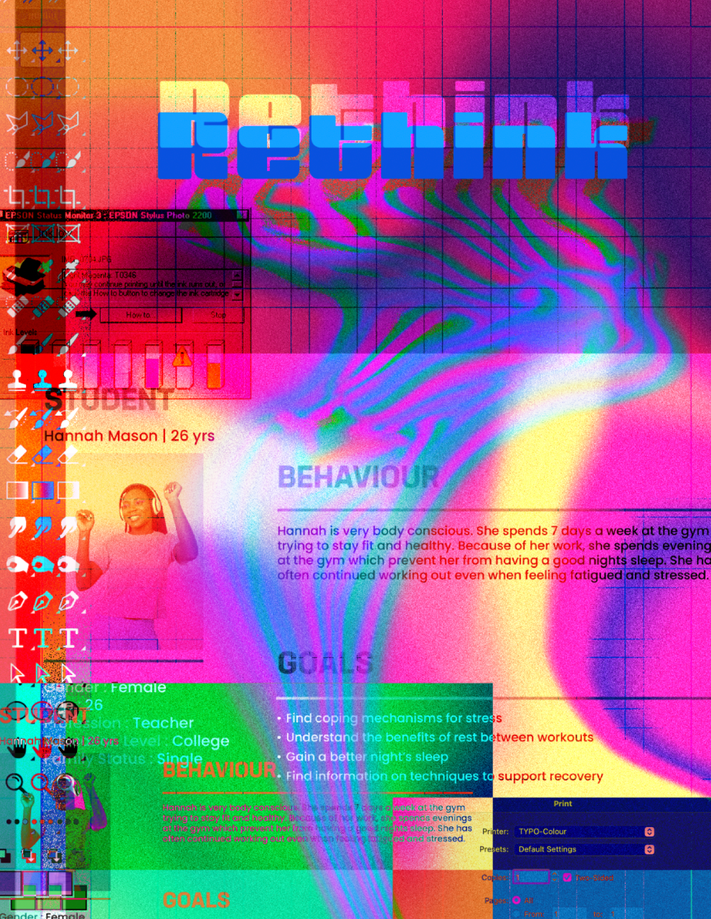
To compliment the logo we wanted to create a background that represented a designers design process. The background was a key part of the visuals and for the rest of the content we were to produce, we felt by creating one visual it would ensure consistency across the different deliverables as well as maintaining our theme of rethinking and reworking, as it includes initial ideas, sketches, and wireframes from real work and projects students had completed on the course.
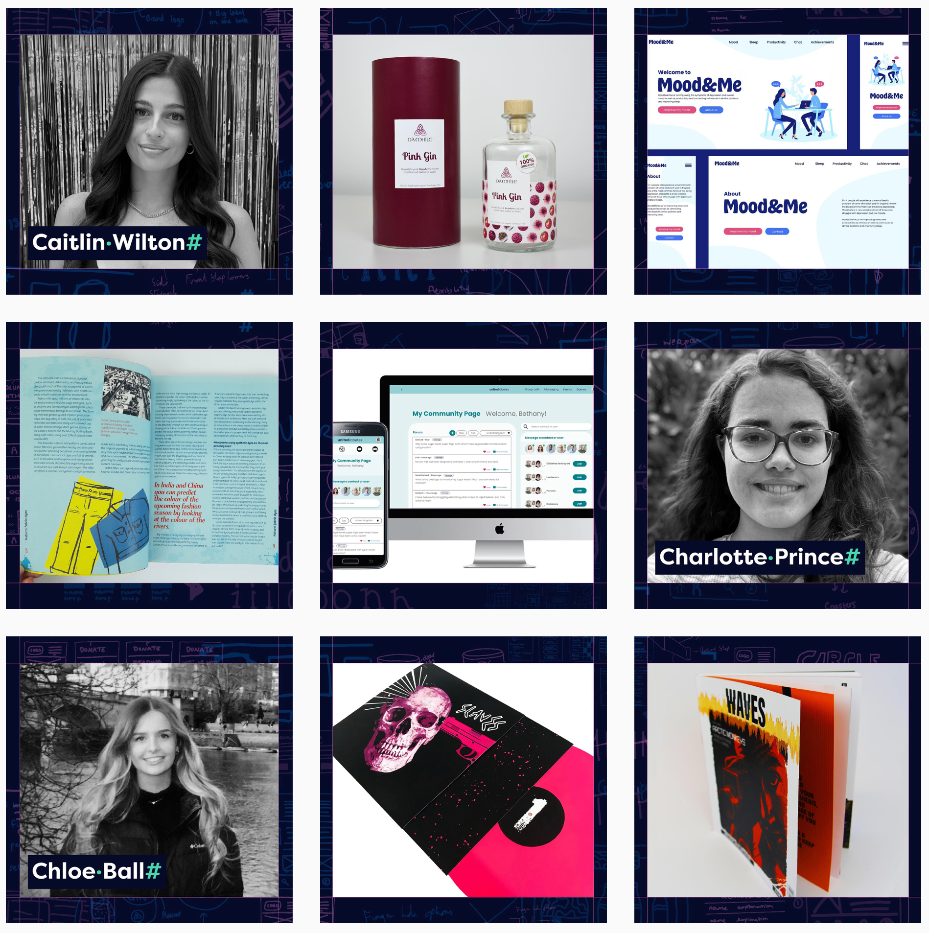
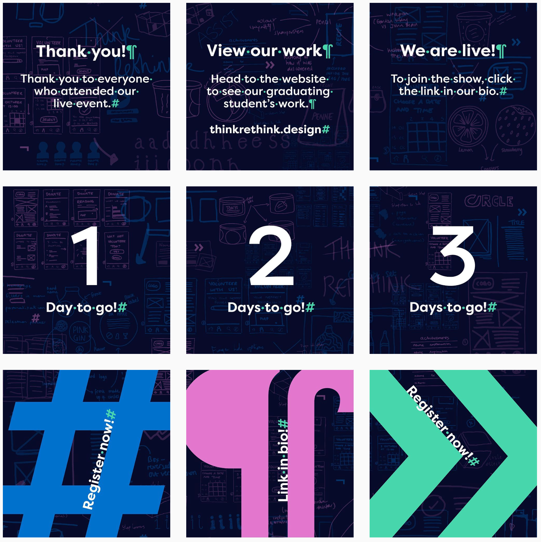
To advertise and promote the show we set up a social media accounts, sent digital and physical invitations, and posted on the universities existing channels. I was in charge of the social media output, which meant I designed visuals and created captions for instagram, twitter and Facebook. Initially it was important to get noticed on these platforms and build up a following, but then, we used instagram as way of showcasing students work. This was effective as it gave a 'sneak peak' or preview to their work and got people excited for the launch of the website. Please check out @thinkrethink.design on instagram.

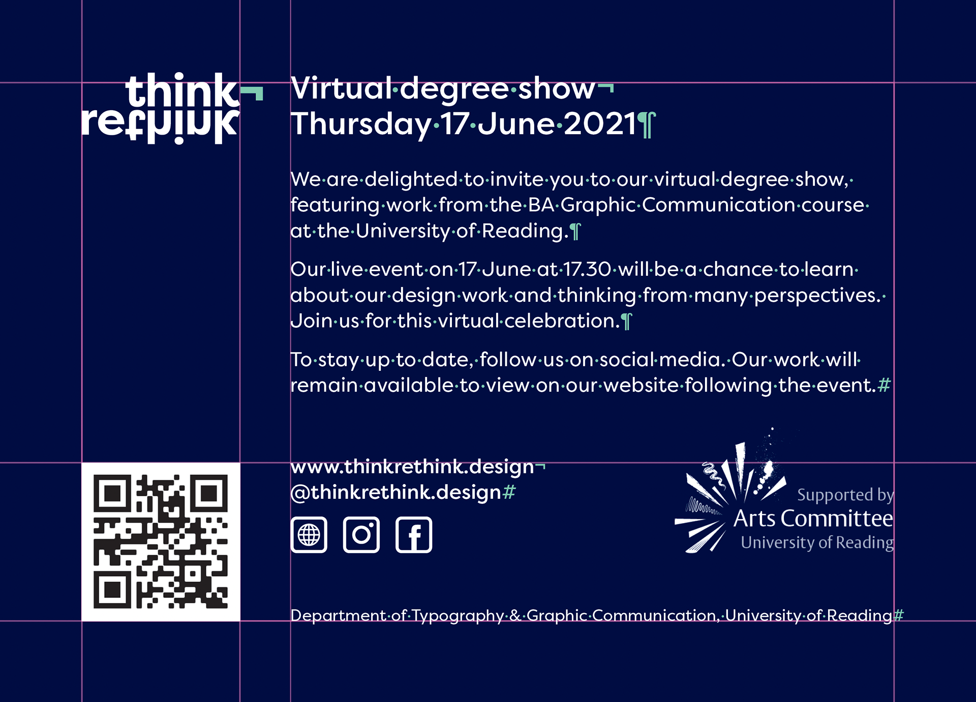
The front and back of our physical invitations which we had triplexed, with our green accent colour sandwiched in the middle. This made for a super sturdy final product. We also included a QR code to link to the website and social media, to connect the printed media with the digital ones.
Website
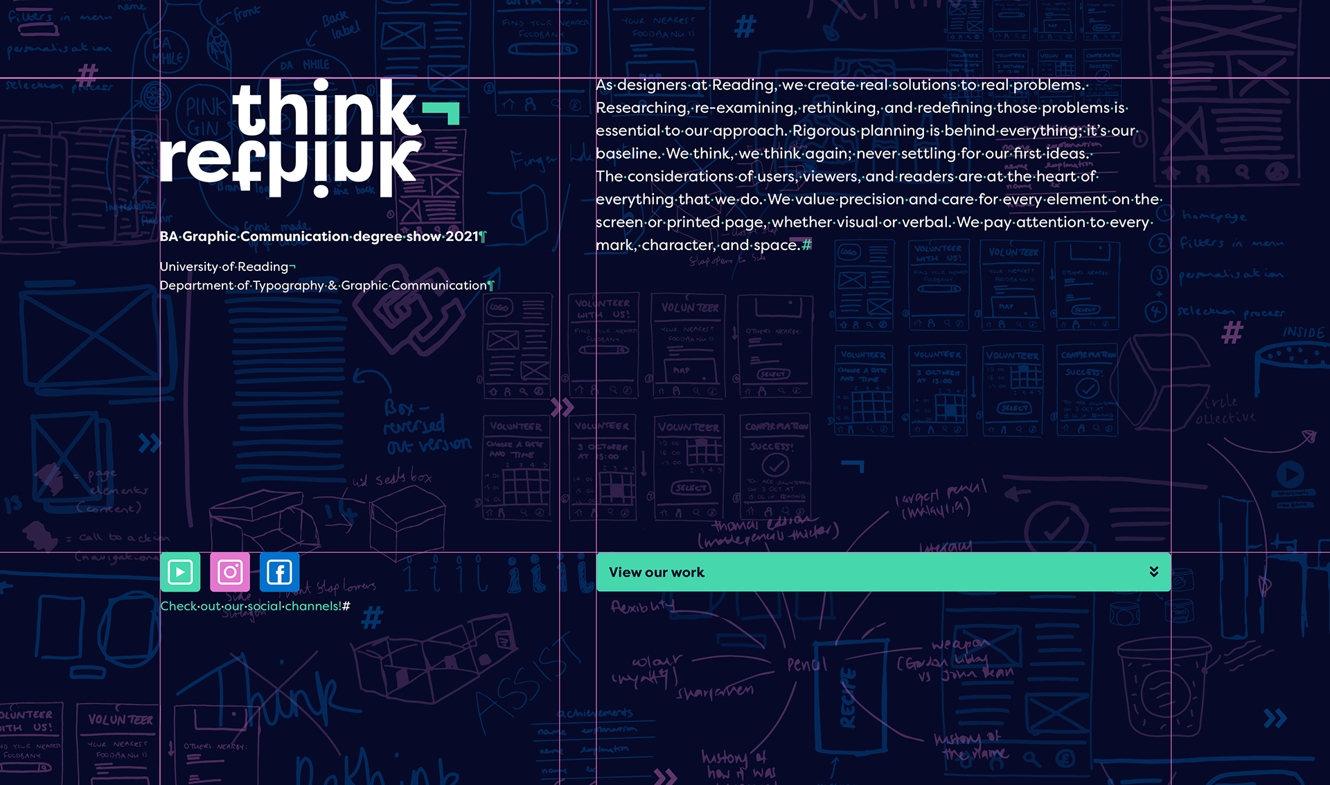
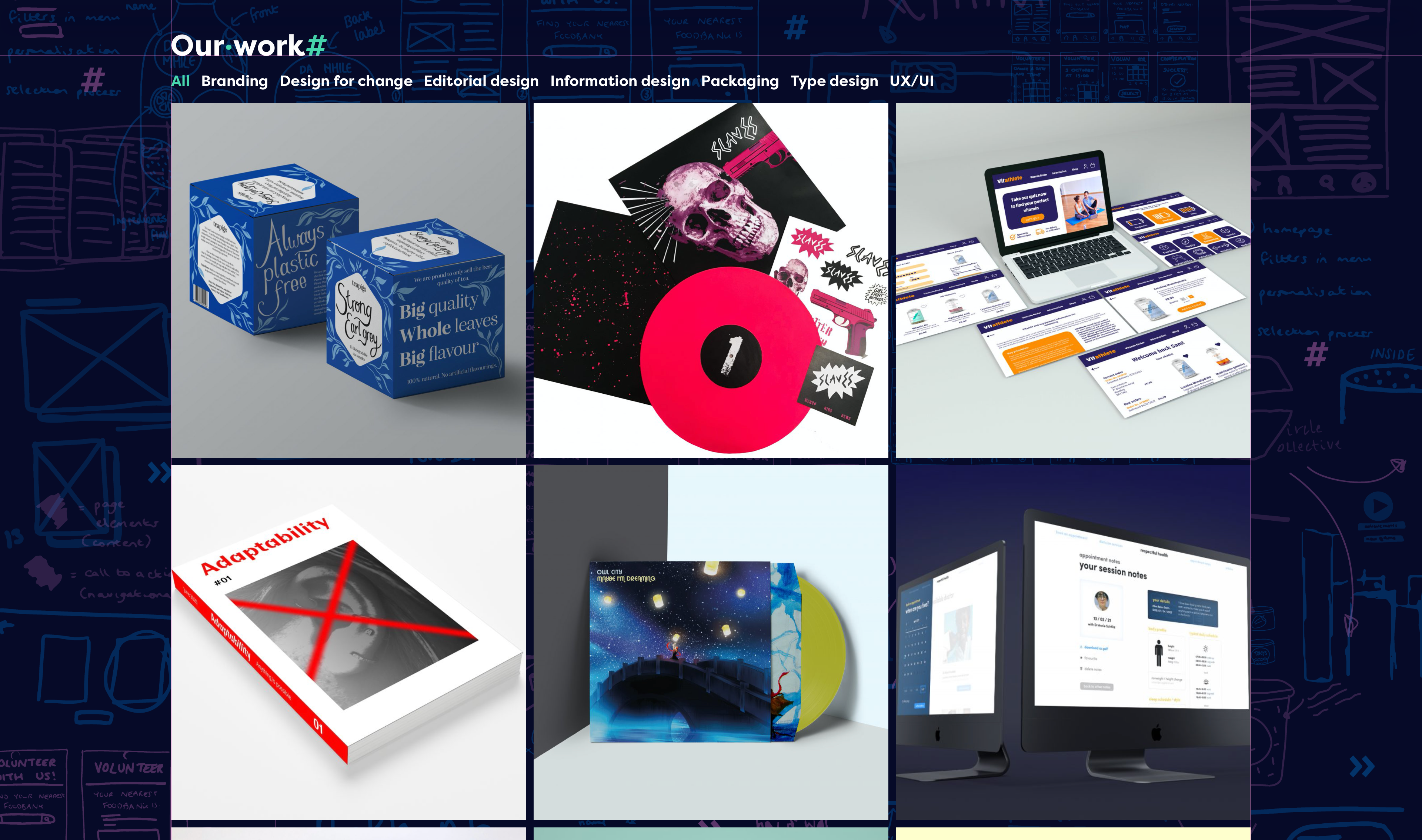
We spent a large proportion of time working on the website as it is a main component of the virtual show. Using the InVision board we had set up, we created iterations of low fidelity wireframes for the home page that allowed us to gain a sense of what we wanted the look and feel of the site to be like. Before the website team took control of the design, we all had a part in prototyping pages of the website, we did this so we could get a clear idea of what everyone had in mind. It allowed us to narrow down ideas together, giving the web design team a strong start in what direction to go in.We have designed the website homepage to present guests with our mission statement, followed by a display of our work. We felt that this would be the most effective way to engage audiences and showcase the work that we have produced. The d esign of the homepage and its features will lead guests straight into our work, and enable them to view it by category, in order to discover the variety of projects we have completed.
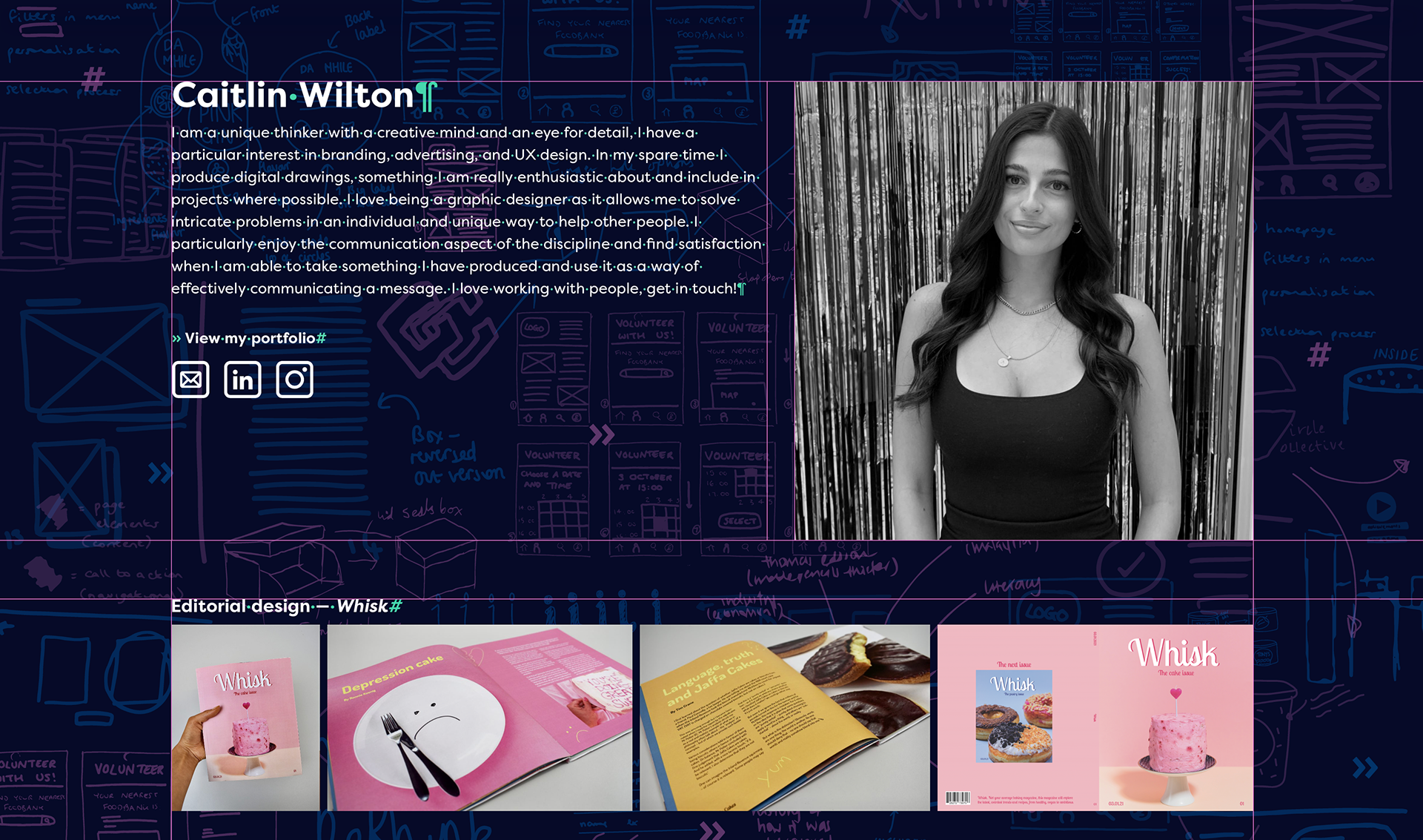
After wireframing the website homepage, we focused our attention onto the individual student pages. Here, we have designed the screen to first show a picture and statement from the student. We felt that this worked most effectively at the start of the page, providing users with an association to the student whose work they are looking at. Following this, we concluded that a carousel would be the most functional and interactive way to show a student’s work. Users will be able to click through the project thumbnails, which will then provide a series of images related to that project, displayed below. We believed that this helped reduce the number of actions it would take for users to complete, and would be the most engaging method of displaying our work. Please view the website by clicking here.
The event
We held out virtual event on Thursday 17 June at 17.30, run by myself and my team members, we included a mixture of live and pre recorded content. Pre-recorded content included us 'interviewing' our fellow students to get them to discuss different kinds of projects, organised by design themes such as UI/UX, editorial, branding, packaging and typeface design. These videos provided an insight into the course and included more students in the show, as well as showcase design process that students go through at Reading to arrive at logical, appropriate and effective outcomes. The show, although a logistical challenge, turned out to be a great success, our practices had paid off as it ran smoothly and we had a great turn out with people keen to interact via microphone or in the digital chat. The pre-recorded content can be viewed either on the website or on our YouTube channel Think Rethink.