Packaging redesign for Welsh gin brand re launch Da Mhile. The project consisted of making the physical and digital packaging for Da Mhile distillery, I chose to re-design a selection of their gins as they have unique and interesting flavours. The final physical outcomes of this project were a set of 3 tubes to transport the gin bottles in, one bottle, and 2 coasters. The other bottles and coasters for the other flavours were made up digitally alongside a set of advertising posters, website, and social media presence.
I thoroughly enjoyed working on this redesign as I made use of my illustrating skills and learnt a great deal when physically crafting the packaging, as well how to produce an effective series design with different deliverables that work together to make a convincing brand.

Physical packaging, bottle and coasters for 'Pink Gin'

Physical packaging for each flavour gin to be transported in
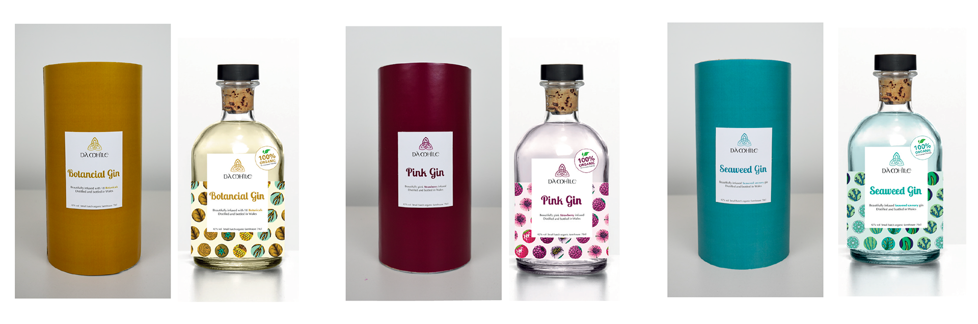
Bottle for each gin flavour with corresponding outer packaging. (Bottles are digital mockups tubes are physical).
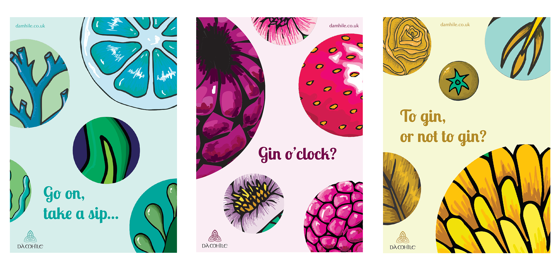
Advertising posters for each flavour gin.
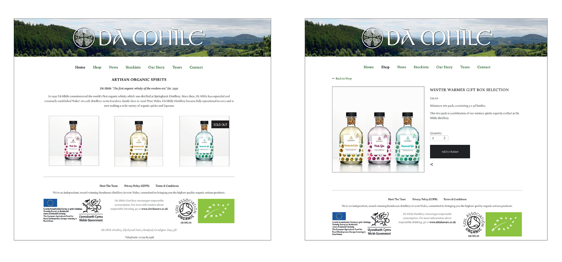
Online presence using Da Mhile's existing website.
Digital coaster mockups.
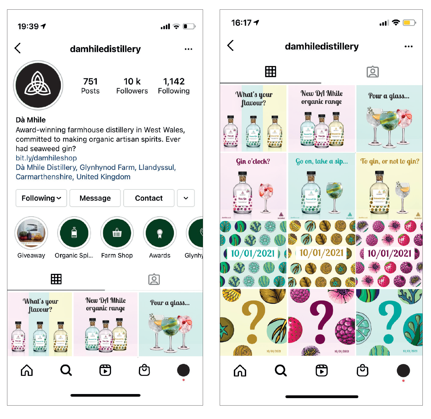
Social media presence.
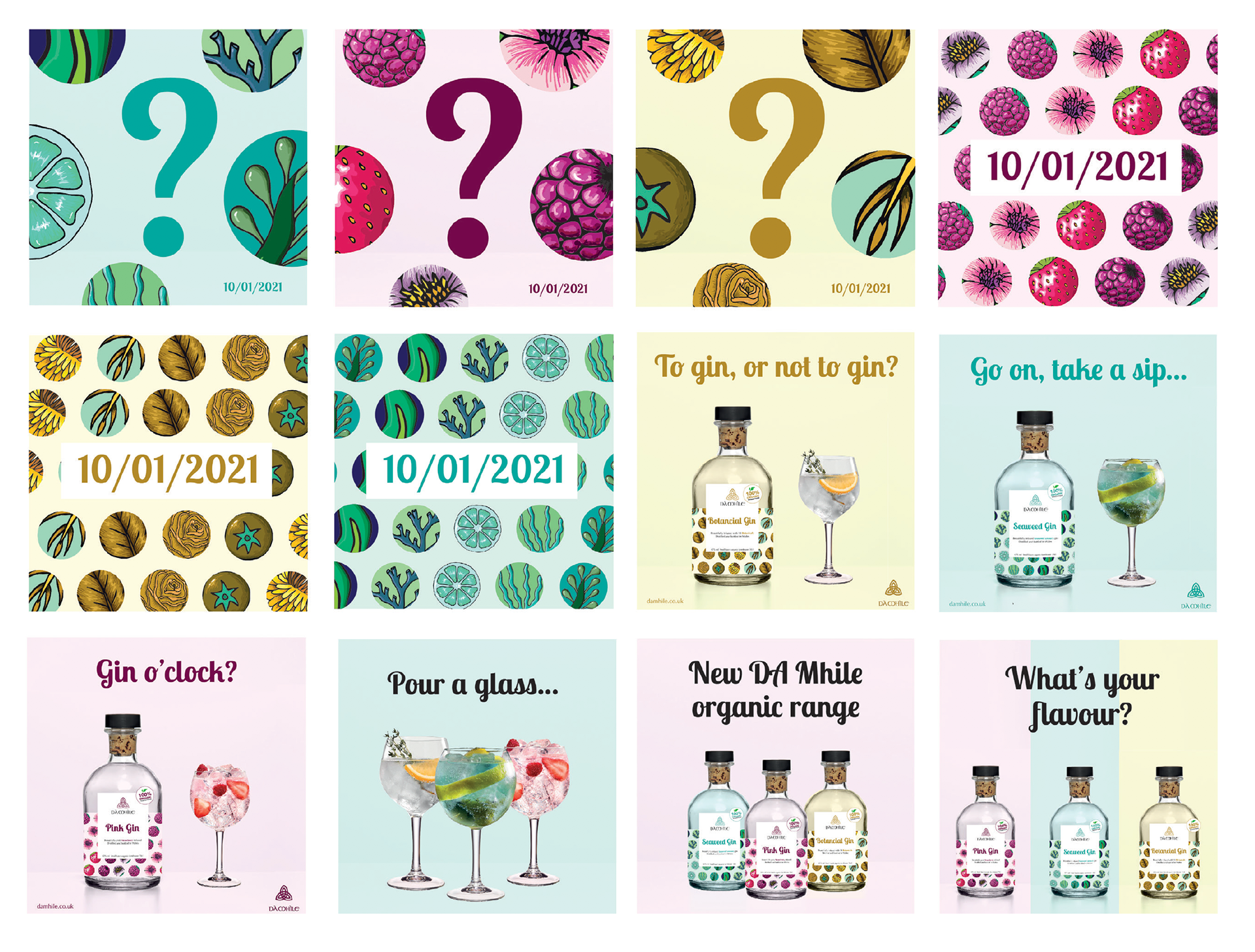
Social media presence.
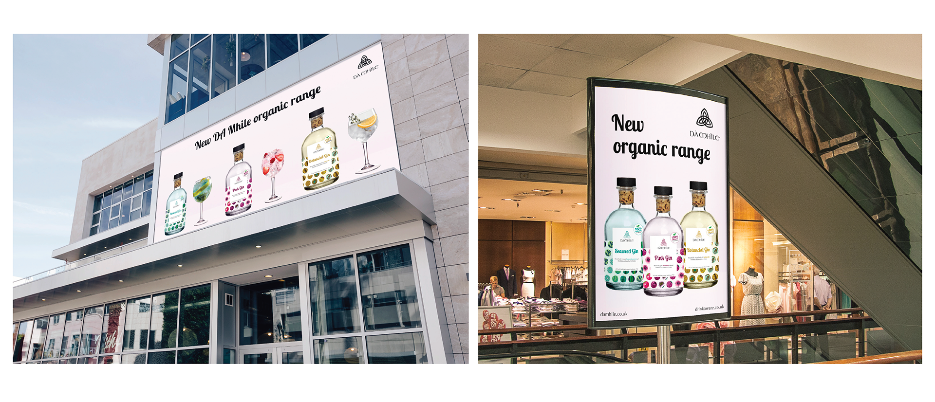
Advertising posters for entire range.
The process of designing this gin packaging was lengthy and involved a lot of different ideas and experiments. I started by researching into Da Mhile's current brand and competitors as well as the current gin market in general; what the standard is for bottles and outer packaging and if there are any common trends. It was also important to look further into potential print finishes and advertising and social media campaigns that are successful.
From there I was able to start sketching initial ideas, including bottle designs, layouts and imagery and develop a few ideas into more solid concepts using a mixture of hand drawing, Adobe illustrator and Indesign to bring the designs to life.
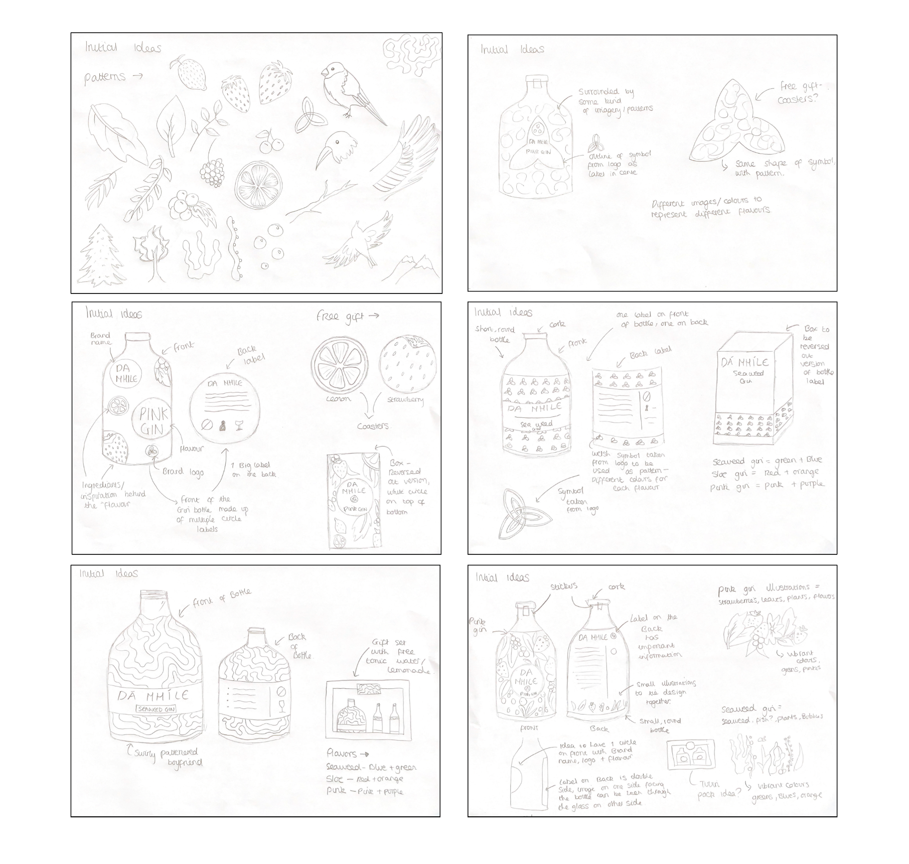
Initial sketches.
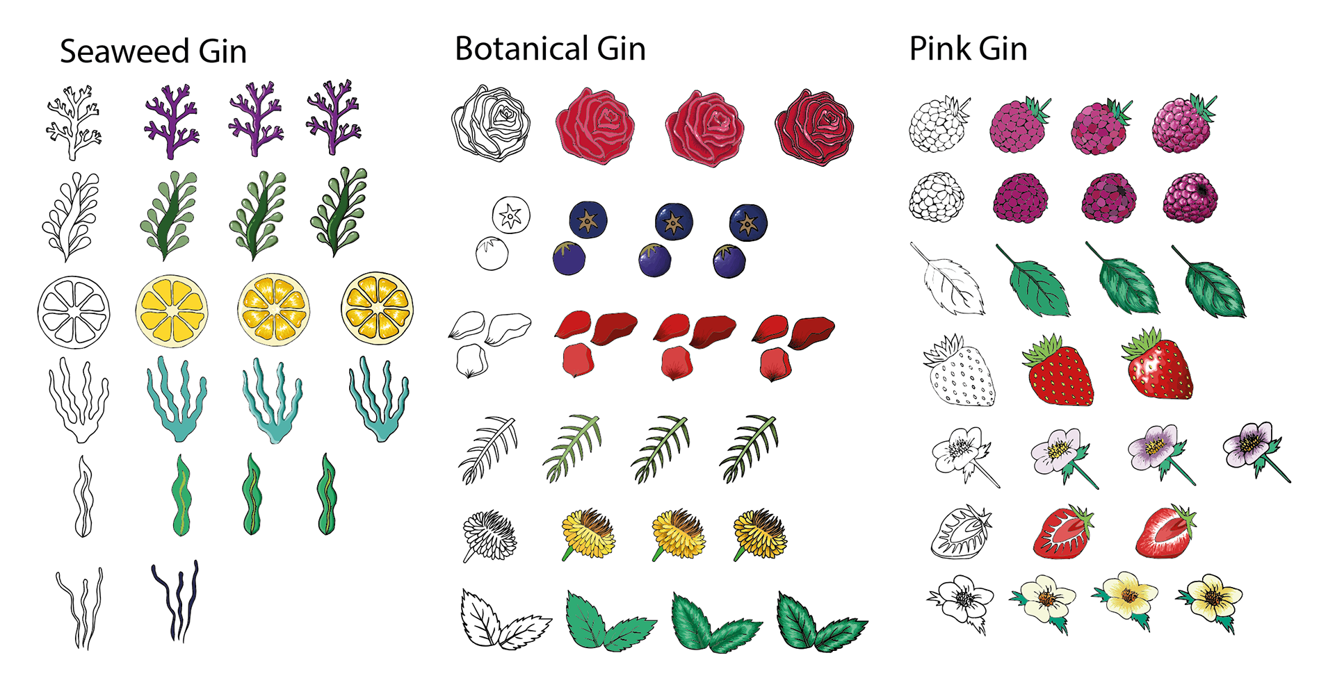
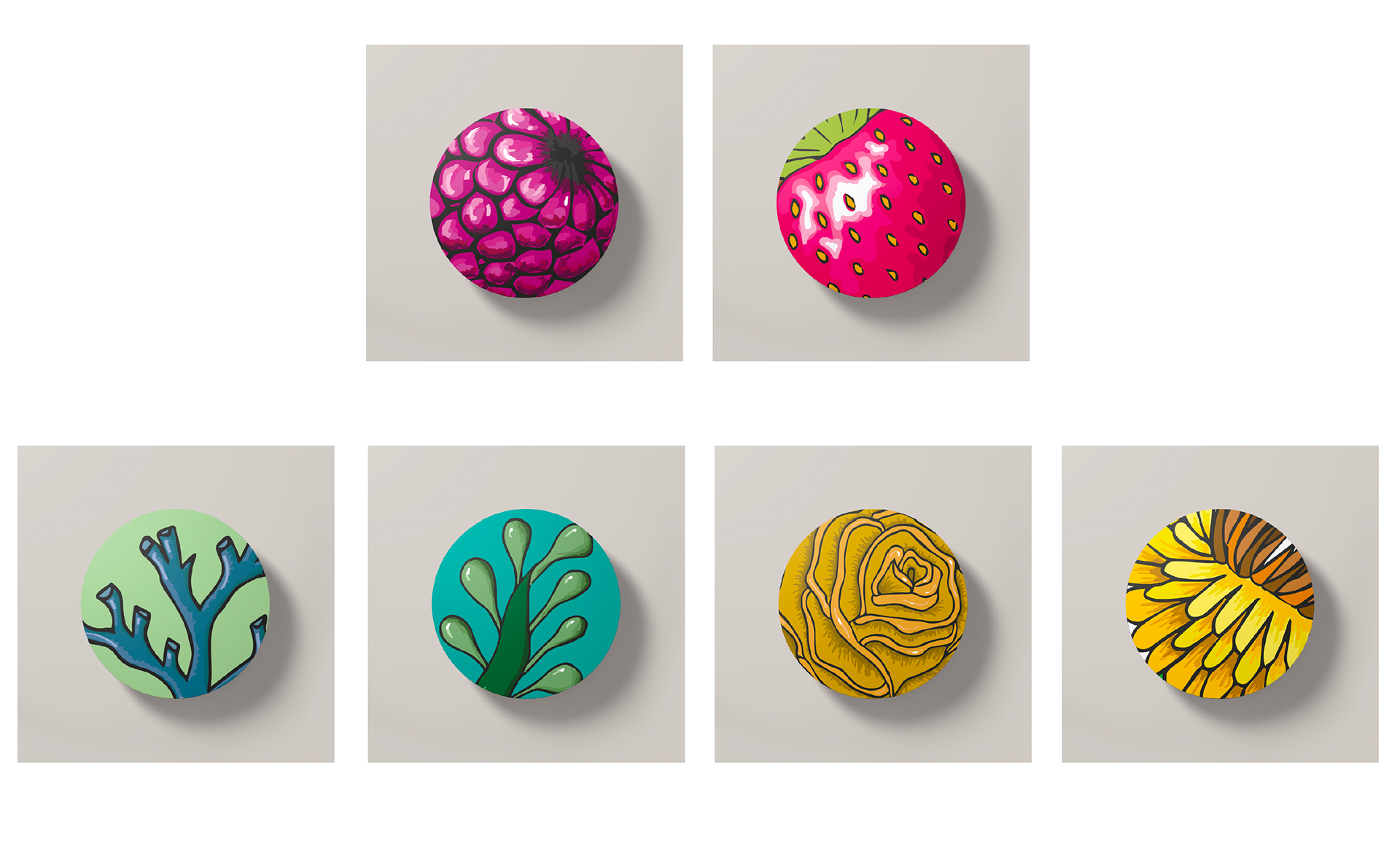
Developed illustrations.
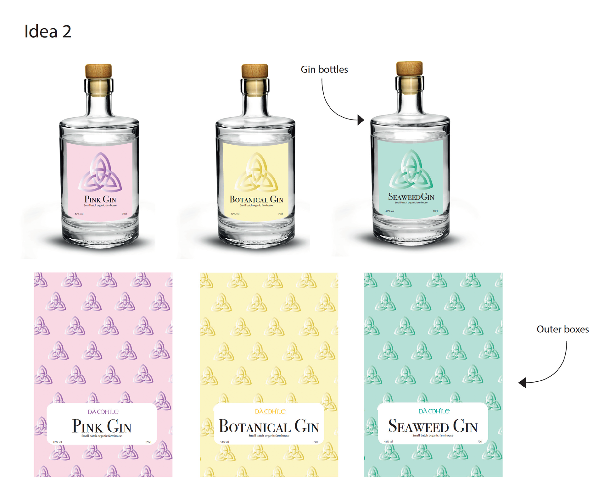
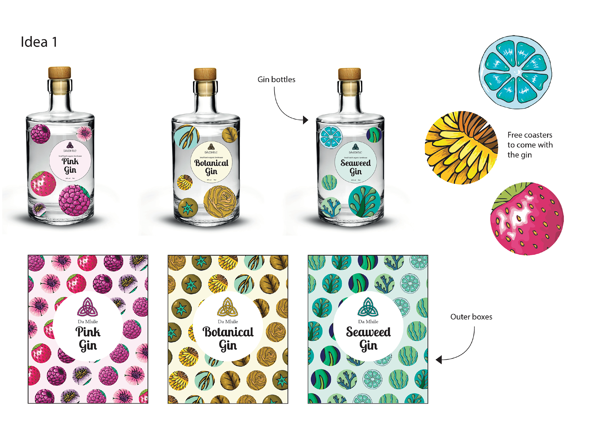
From the start I favoured a design using circular labels and was keen on using illustrations to display the ingredients that make up the gin flavour. However the design wasn't progressing enough and lacked sensibility and justification for having so many labels, during feedback I also found it was difficult for people to tell the different flavours apart. As a result I gave each flavour a stronger colour scheme of 1 or 2 colours, related to the imagery and flavour. This helped to differentiate each flavour straight away and make the gins look like a more defined series, however it still was not working.
Developed bottle design.
Developed bottle design.
I had developed 2 other strong ideas for the visual design alongside my main idea as it was important to explore all routes. I liked elements of each of these designs and felt they had potential, however I still felt my original idea was the most interesting and would stand out the most against competitors.
Potential concept.
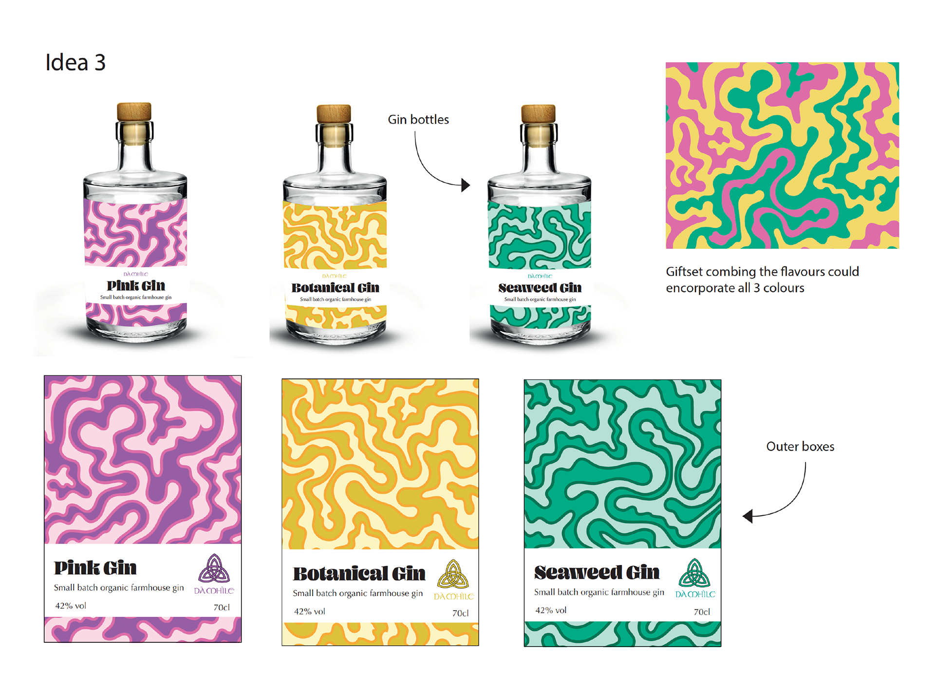
Potential concept.
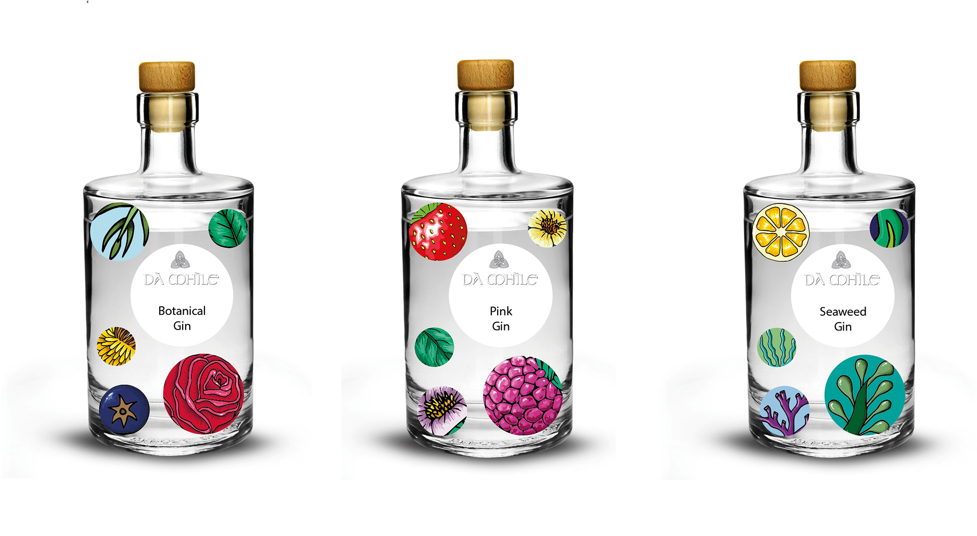
After exploring different ideas I wanted to stick with the illustrative circle concept, and looked into different ways of using the design on the outer packaging as well as re imagining the bottle label. I looked back at my initial research into competitors and the current market for inspiration and came up with two different label ideas. Straight away I was drawn to my second idea which made the illustrative pattern much smaller and wrap around the bottle, with a cut out effect display the necessary information. I think this was successful as it is the most eye catching and premium looking.
Potential concept.
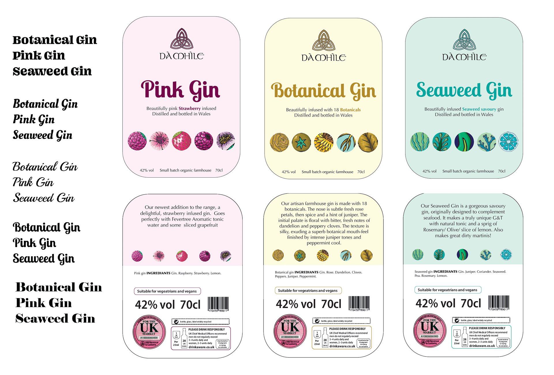
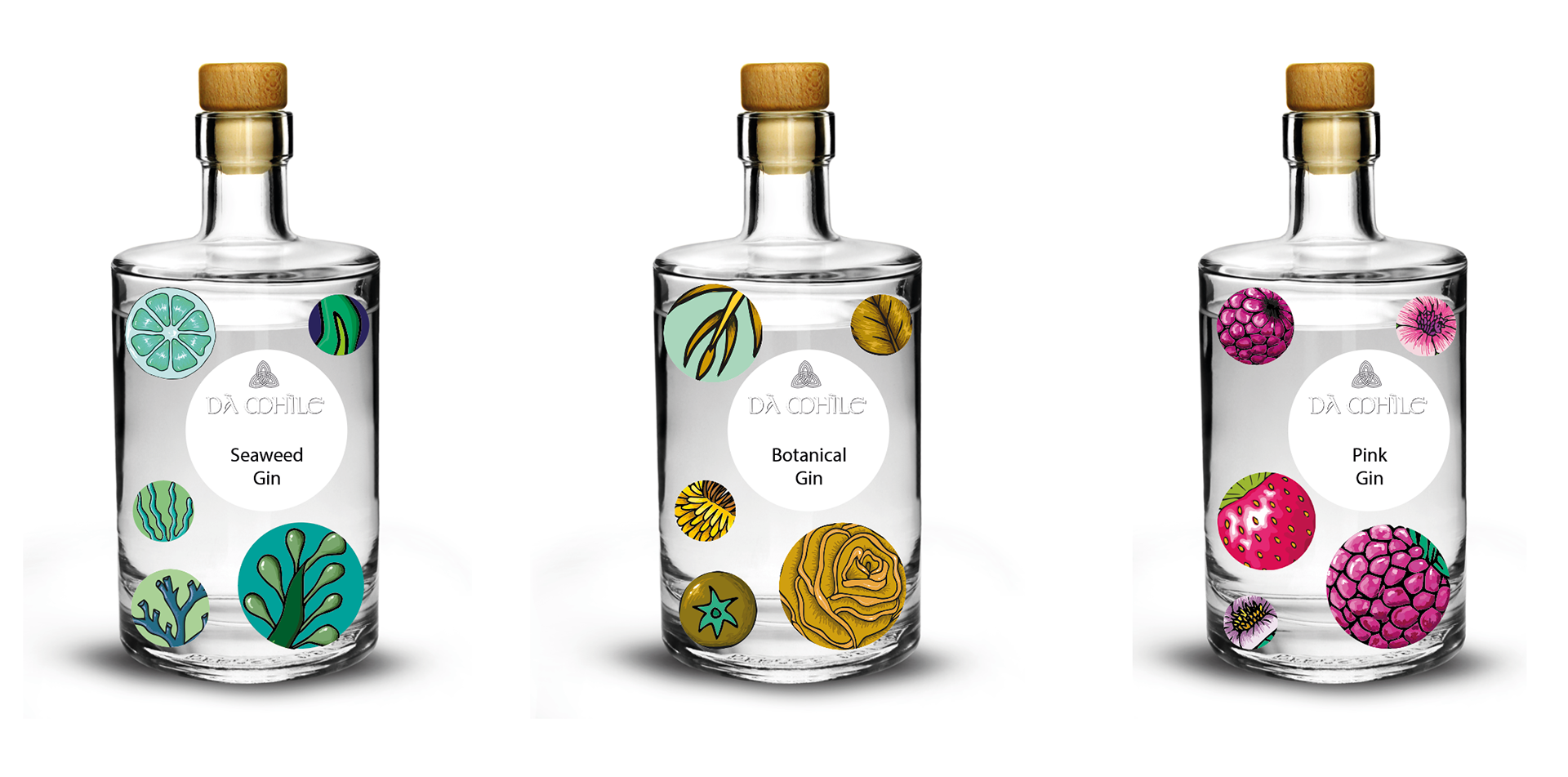
Developed bottle label.
At this stage I had a completed bottle label, however I still had no visible USP. Throughout my design process I had been working with the idea that this was going to be a new gin range for Da Mhile, and throughout I had been using organic shapes, imagery, and colours and focusing on what makes these products special which is where they come from and how they are produced. As a result I wanted this to be extra clear on the bottle. To do this I created an ‘organic product’ sticker to sit on top of the main label.
I received feedback on my first iteration of this (see top) and found that it was standing out too much and becoming much more of a feature than it should be. As a result I changed the typeface to one with a lighter weight and reduced the amount of text overall. There was also too much black on the sticker compared to the rest of the design which made it look too heavy, so I changed it to match the colours already being used. Overall this became more successful and the two components sit comfortably together without fighting.
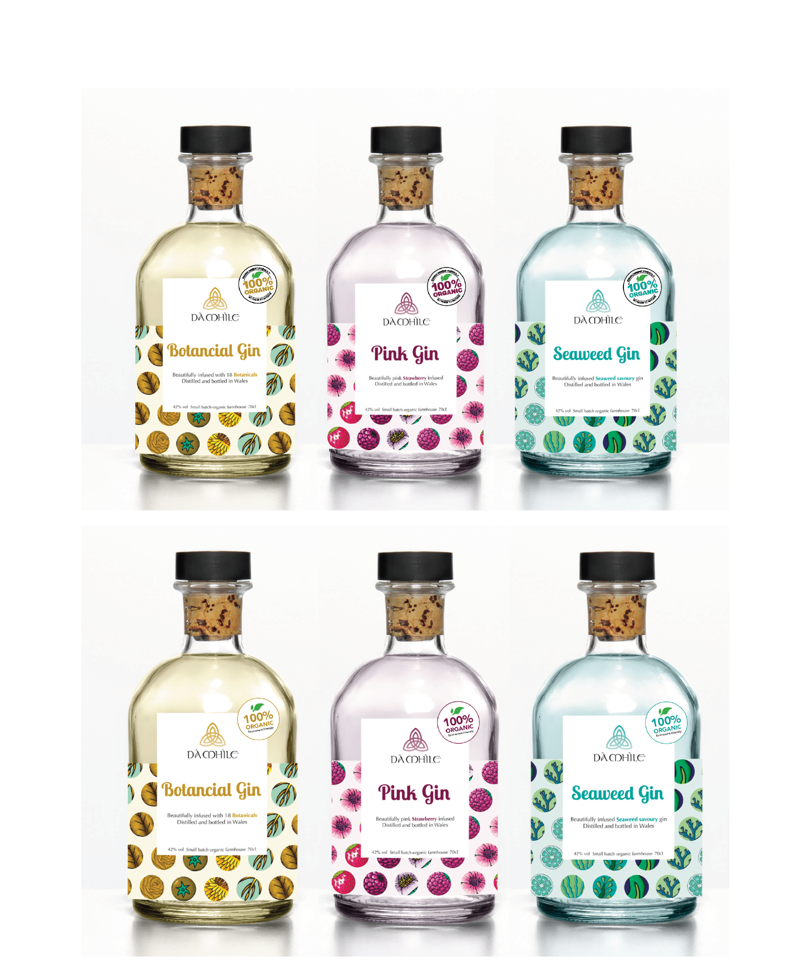
Bottle mockups with organic label.
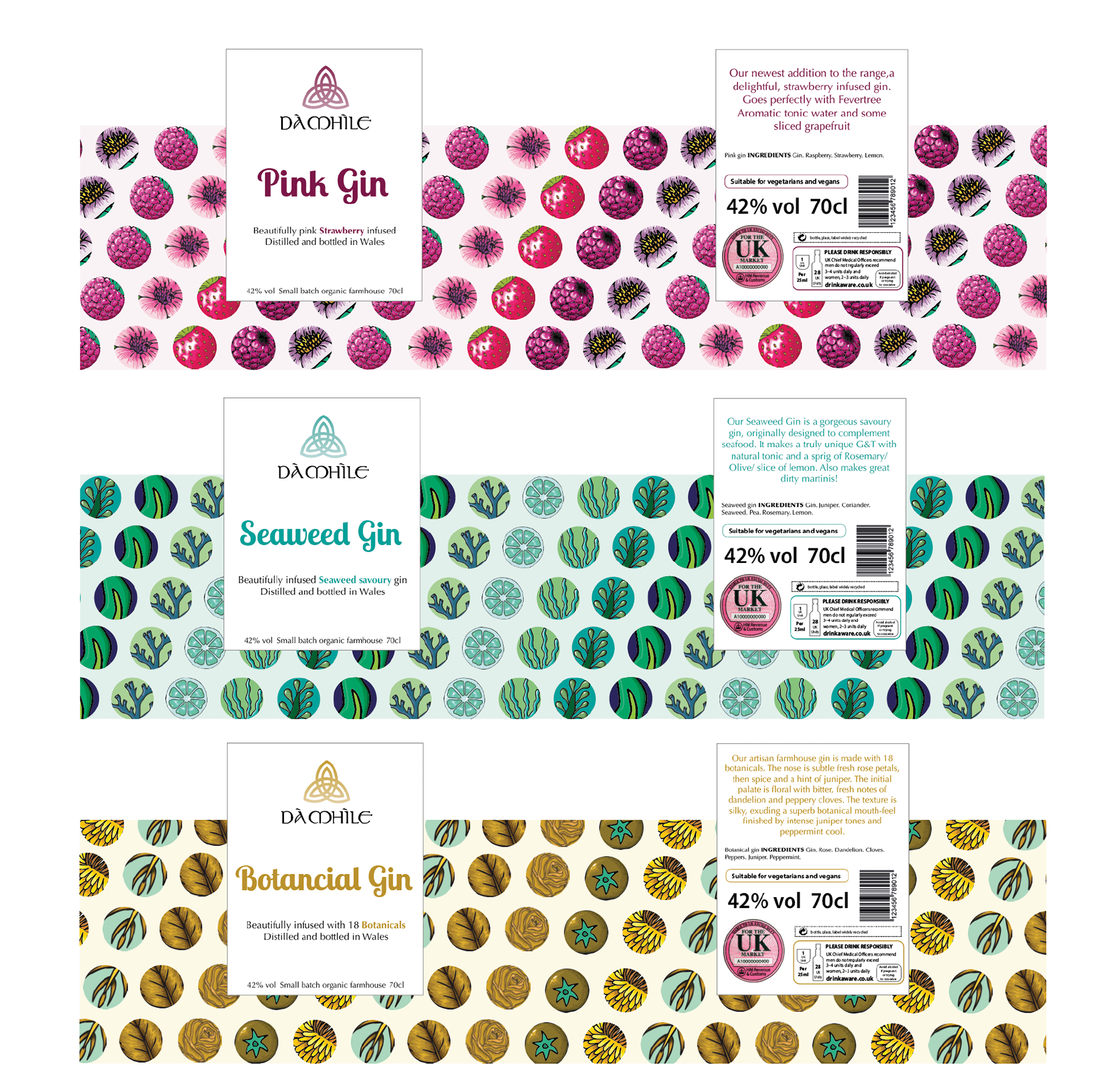
Final bottle label.