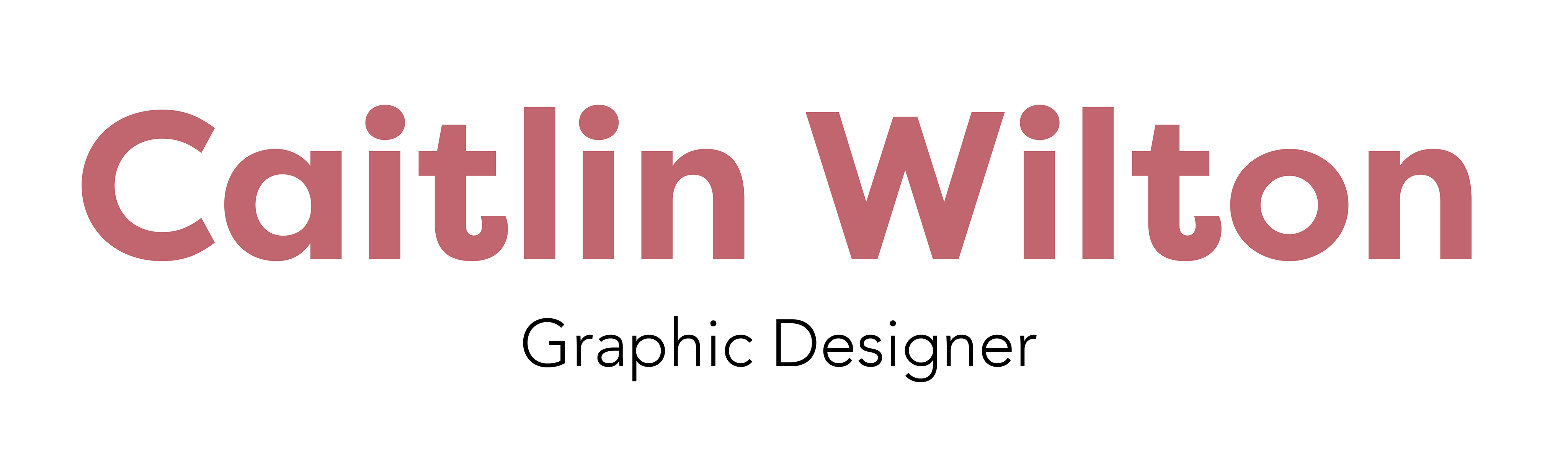
I chose to do typeface design in my final year because I wanted to expand my typography knowledge and learn about the process it takes to design type. During this project I created my own typeface 'Wilton' with 57 characters in total. The typeface was produced using glyphs and is a curvy san serif font with a heavy weight and bold out strokes, ideal for editorial design such as magazines.
The process of designing a typeface was a new experience for me and taught me a great deal about what goes into typeface design. From everything that needs to be thought about before any drawing takes place, to the small details that could be overlooked and ways to ensure consistency across characters. I also learnt how to use the software Glyphs from scratch which I got the hand of and enjoyed using so hopefully I will have the chance to use it again in the future. It would also be great to expand my typeface and eventually add more characters such as numbers as well as various weights and italics to make the typeface more functional.

The complete set of characters for 'Wilton'.
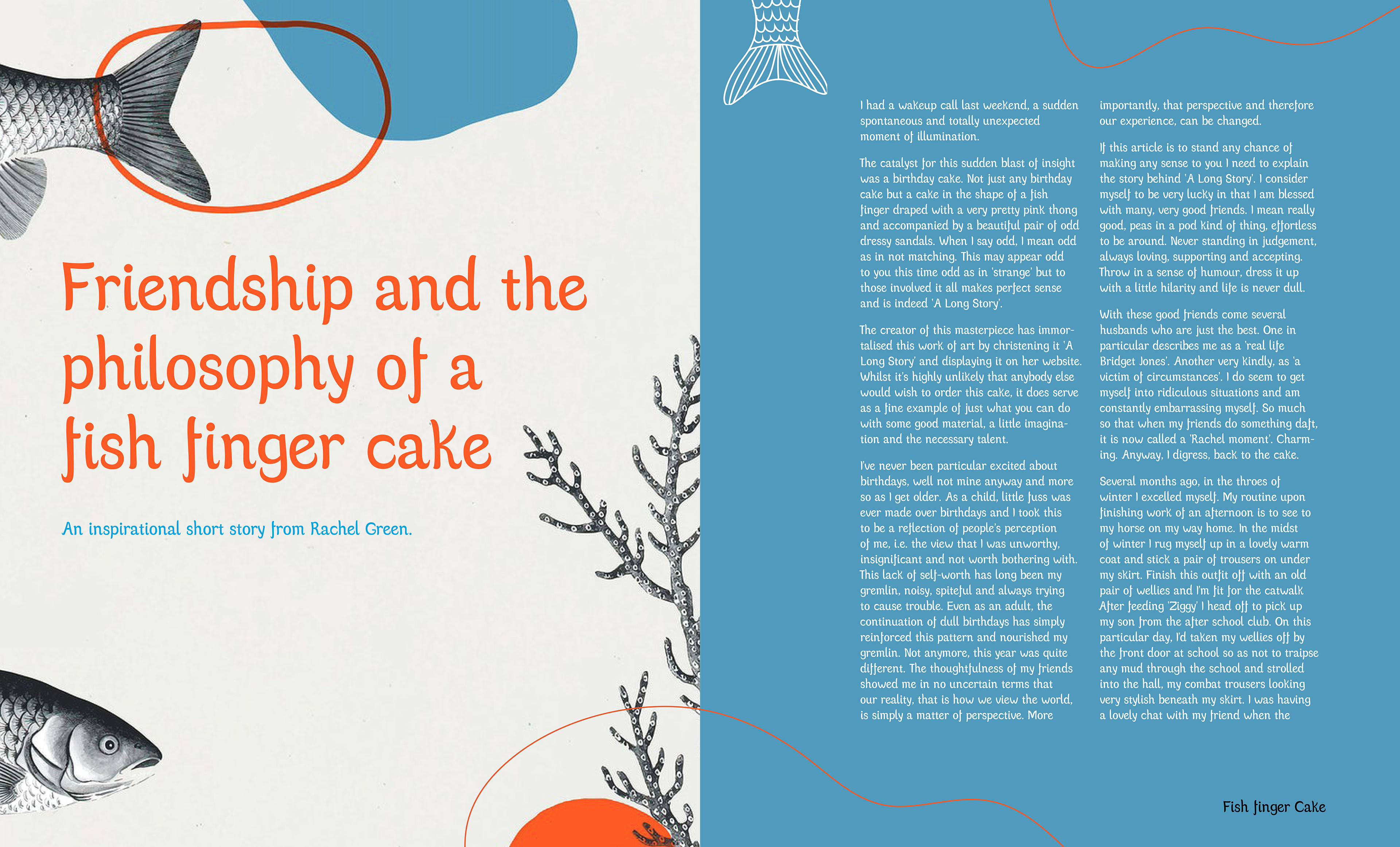
Typeface in use in independant magazine.
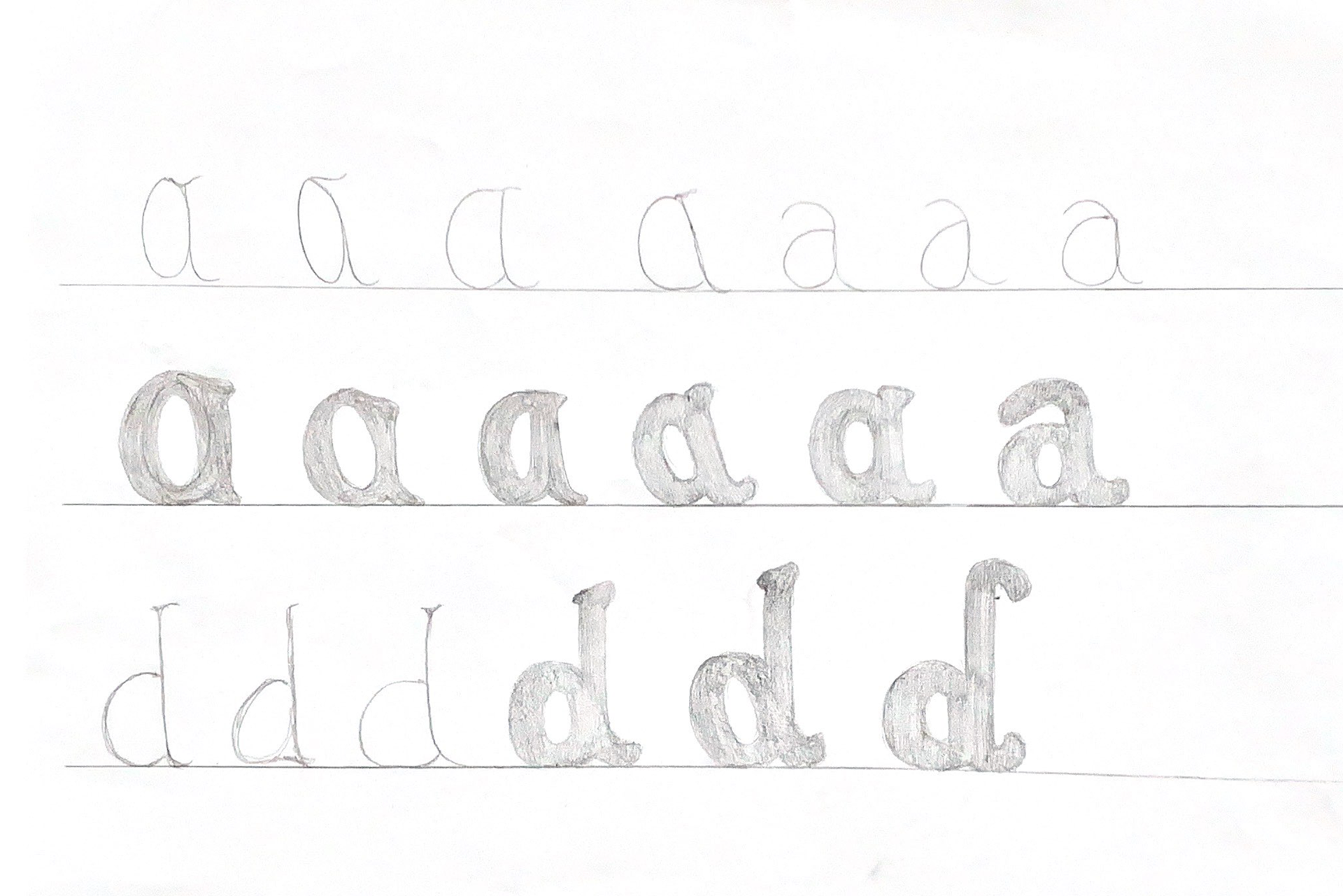
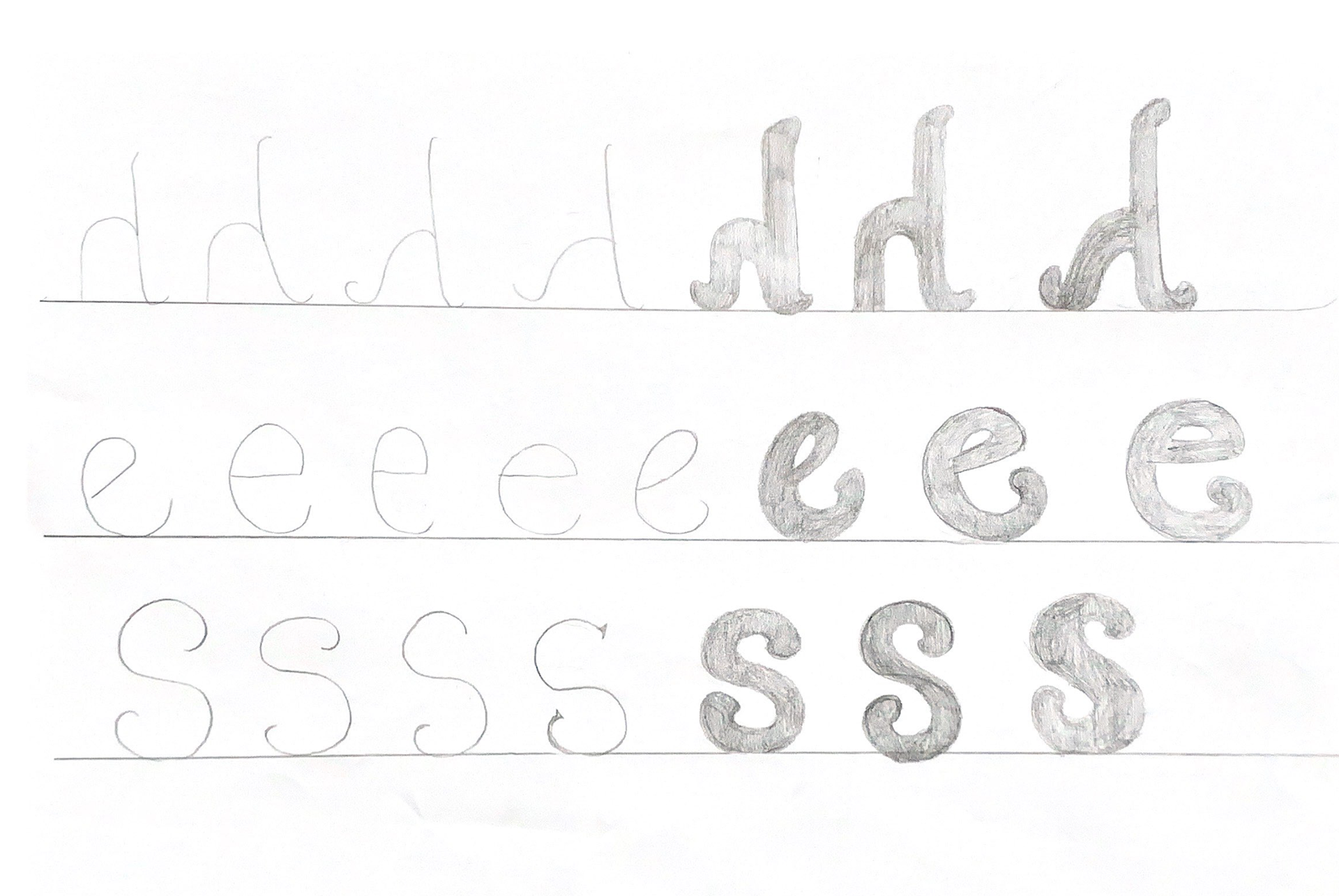
The process of designing this typeface started with research and looking at existing fonts for inspiration, I then thought about what characteristics I wanted to produce and started sketching individual letters. At this stage it was important to think about what traditional tools would have been used to produce the letters and reflect this in the in and out strokes. Once I had developed sketches I scanned these in and drew over them in glyphs to create the basic letters. From there I developed the characters and font as a whole from week to week, using feedback from Gerry Leonidas, an expert in the field. Overall I am happy with the way it came out and thoroughly enjoyed the process.
Initial sketches
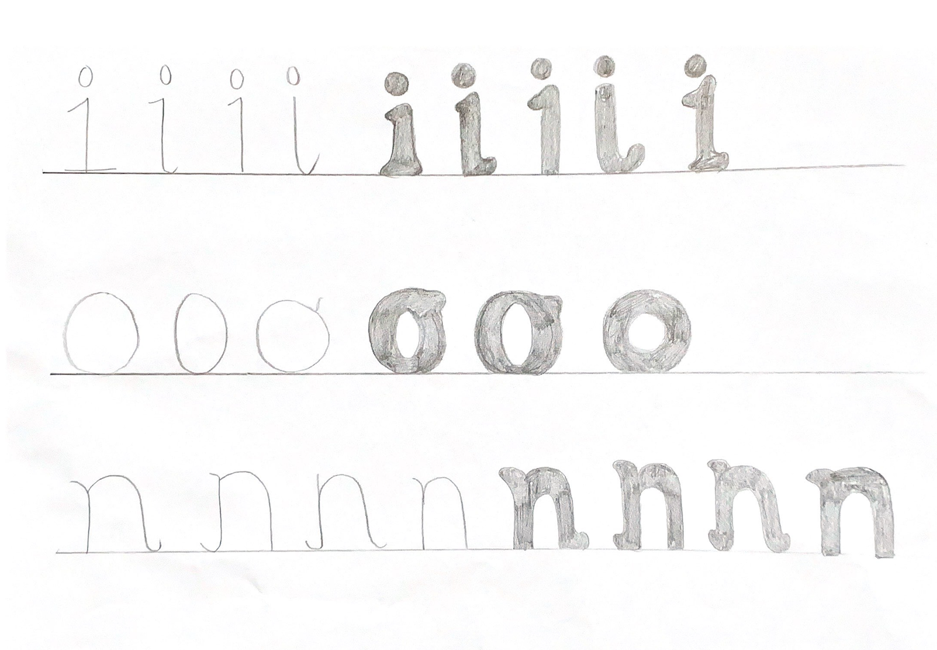
Initial sketches

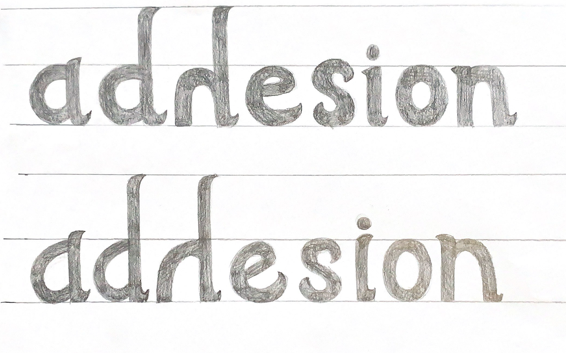
Developed sketches
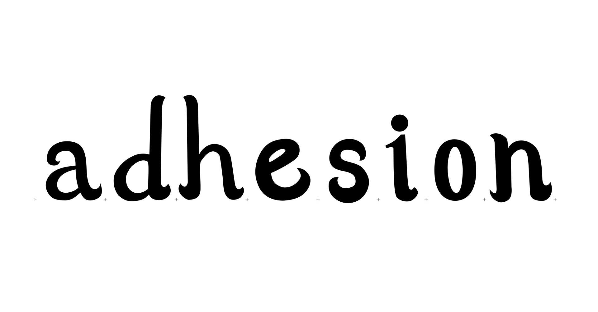
First attempt at characters in Glyphs.
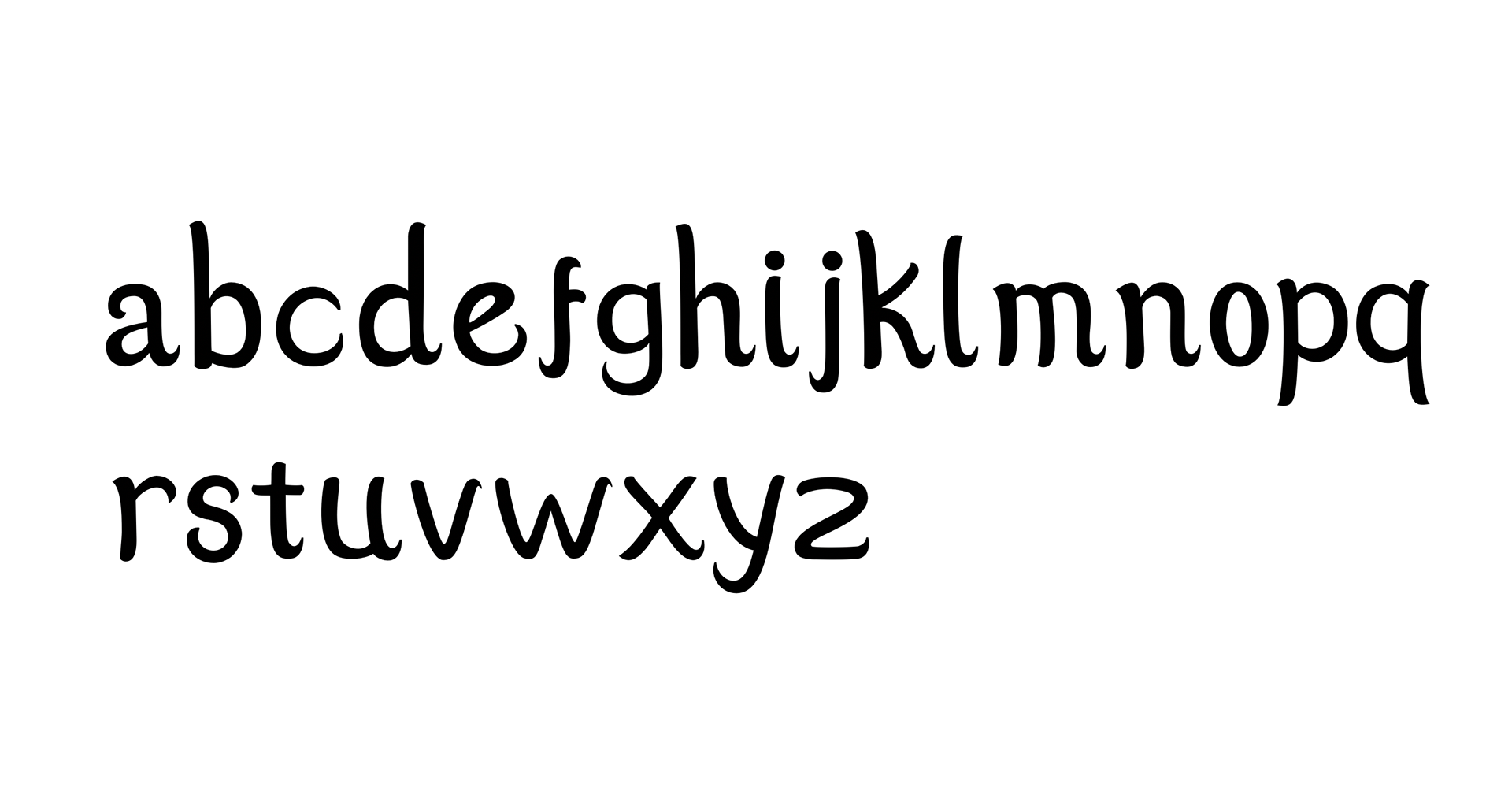
First full set of letters in Glyphs. I carried on developing these until I settled on the final outcome.